Artists' Statements
Art Vent Letting the Fresh Air In
September 6, 2010

Doris Salcedo, Shibboleth (2008), Tate Modern, London
Thanks for the thoughtful comments on the post below, and if you didn’t read them before, please do. They are all worth reprinting, but here are two snippets:
“beebe” said: The problem at this point is systemic. Having somewhat recently gone through an MFA program, the main focus was on the statement--talking about the work, weaving a skein of bullshit around the work. The language surrounding the work and your inevitable defense of the language (and, secondarily of course, the work) is more important than actively making better work.
From “CAP”: Even critics want to take their cue from the artist's best intentions, in advancing an interpretation or assessment. But this really reflects a lack of confidence in an historical framework and personal intuition. The critic turns to intention to skirt thornier issues of style and form….
Whenever I bring up artist’s statements, it seems to touch a nerve. And rarely, if ever, have I gotten a comment in their defense (such as “I love artist’s statements!” “Once I read one, I can't wait to read more!”) yet they persist—like the weather, everyone talks about them but no one actually does anything.
There are several issues at play here. “Thi Bui” who doesn’t like “self-absorbed or insincere statements either” asks, however, “why don't we care about where the work comes from, or what the artist is trying to do?”
We don’t care because it has nothing to do with the experience of the work. Like music, the beauty of visual art—emphasis on the word visual—is its ability to communicate through non-verbal means, and is therefore more about sensation than thought. The delight is in its mystery, which by its nature defies explanation. If we want to communicate messages, writing is a better vehicle.
Also, any statement that tells us what a work is about or what the artist intends, limits the interpretation—in effect it pre-digests the experience so that it's hard to see it through any other lens. My favorite example is Doris Salcedo’s (2008) installation,
the “crack” at the Tate Modern that I wrote about with relish in two blog posts. On its own, the piece was quite powerful; recalling fault lines or dry riverbeds, it threatened our sense of stability and security, brought to mind all manner of social and physical separations and divisions, the unknown beneath our feet, the feeling that nothing is permanent, nothing is forever, that there are forces bigger than ourselves….and I’m just getting started. But once you become aware that Salcedo sees her work as “addressing a long legacy of racism and colonialism that underlies the modern world…” the whole thing goes flat, suddenly no more than a grandiose illustration of a lofty and banal idea.
Artists work from instinct, and may not be aware of the various possibilities of experience and interpretation that the work makes available. Interpretation is the work of philosophers and critics, and as an artist I’ve learned more about what my work “means” by reading about it than I did through the thoroughly intuitive process of making it.
The problem is that curators and critics are also relying on biography, intention, and social content to interpret art and justify it. When I wrote my article about Anne Truitt for Art in America, I devoted a portion of the article and several blog posts (see label for Anne Truitt) to the way the curator insisted on interpreting Truitt’s work through biography in the most elementary way—while acknowledging that “Truitt herself was reticent to make fully explicit the connections she nevertheless acknowledged between her life and art.” I came to the conclusion that the curator, who was a graduate of a curatorial program, simply did not know any other way to assess art.
However there is another way: observation
—
the act of looking at and experiencing the work and, as CAP points out, having confidence in our personal intuition.
What’s there is there, right in front of you, and what’s not there is….not.

Photo: Carol Diehl (2008)
Comments (10)
August 29, 2010
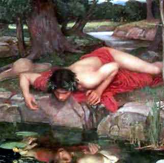
JohnWilliams Waterhouse (1849-1917) Echo and Narcissus (detail). Copyright may apply.
It’s the eve of another art season and here I go again with my annual (semi-annual? daily?) rant about artist’s statements. As I’ve said numerous times before, when I am king, I will abolish them. It’s just not happening fast enough.
Every day or so I get a newsletter from NY Arts which, along with a lot of helpful, newsy articles, includes their seasonal “Editorial Preview” of an artist’s work, based on the artist’s statement. What it demonstrates is that a certain solipsistic way of writing and thinking about art has become an international epidemic.
Chinese artist: “My work mainly comes from my own personal experience.”
Romanian artist: “I see my work as a process of a constant production of the self.”
Italian artist: “I developed this concept from a personal perspective; in fact, most of my artworks are autobiographical and describe a familiar conflict.”
American artist: “I was always defined (and profoundly accepted) by the identity markers that were given to me, Chicana, female, lesbian, working-class, etc. But, now I am expanding those ideas to include a larger worldview that positions me as a central part in the landscape of nature.”
Romanian artist: “I feel that my art is an uninhibited territory for me….All around, my works are thoughts and emotions turned from the inside out, like you would a stuffed teddy bear.”
(Note: The preponderance of Romanian artists doesn’t necessarily reflect a particular cultural self-absorption, there were just more of them represented on the site.)
I mean, really, who gives a flying fuck where the work comes from or what the artist is “trying” to do? We don’t care! We don’t care about what you “want” to do, are “trying” to do, how miserable or fabulous your childhood was, or what you’ve always been interested/fascinated/obsessed with. We don’t care about your relationship with your culture, and we certainly don’t want to know about your relationship with your body.
Show me the money!
July 25, 2010

Marcel Duchamp, Rotoreliefs (1935), Alan Koppol Gallery, Chicago.
Do leave comments, even if it’s just to say hi, because even though I can see the stats, I often forget that there are real people out there. I’ve been in that state of forgetfulness since coming back from Europe, and then last night went to Brenda Goodman’s opening at the John Davis Gallery in
Also the heat has taken me over, my big obsession being whether or not I should get air conditioning (which I haven’t needed before) for the studio—a major expense. By the time I make up my mind, we’ll be into another Ice Age.
So since I’m not generating original ideas, I’ll put forth those of another—Marcel Duchamp, with whom I seem to agree about everything. Calvin Tomkins’s biography titled, not surprisingly, Duchamp: A Biography , is without a doubt the best biography of an artist I’ve read (don’t get slowed down by the first chapter but save it for the end, when it’s more meaningful). I got the book out to lend to a friend—perfect summer reading—and then kept it to peruse the phrases I highlighted back in 1996.
Duchamp, who used to say that the artist never really knew what he was doing or why, declined to offer any such explanations for The Large Glass. One of his pet theories was that the artist performed only one part of the creative process and it was up to the viewer to complete that process by interpreting the work and assessing its permanent value. (p.11)
“I do not believe that art should have anything in common with definitive theories that are apart from it. That is too much like propaganda.” (p. 152)
Works of art could not be understood by the intellect, [Duchamp] maintained, nor could their effect be conveyed in words. The only valid approach to them was through an emotion that had “some analogy with religious faith or sexual attraction—an esthetic echo. This echo, however, was heard and appreciated by very few people. It could not be learned—either you had it or you did not—and it had nothing whatsoever to do with taste, which was merely a parroting of established opinion. “Taste gives a sensuous feeling, not an esthetic emotion,” Duchamp said, “Taste presupposed a domineering onlooker who dictates what he likes and dislikes, and translates it into beautiful and ugly, whereas “the ‘victim’ of an esthetic echo is comparable to that of a man in love or a believer…when touched by esthetic revelation, the same man in an almost ecstatic mood, becomes receptive and humble.”
I don’t think you would've caught Marcel writing an artist’s statement.
April 25, 2010
 The garden at the Writer’s Villa, Los Angeles
I can’t believe I’m sitting here in the SoCal sun, listening to the trickle of water in the fountain, and still thinking about critiques and artists’ statements. But that's the lot of one who checks her email assiduously. So here is a comment from CAP regarding my last post: "Art Jury, but not really":
Like “Concerned,” I'm puzzled why the panel disparages artists' statements, and then picks out one of which they approve.
Why not just address the work/slide?
Fair enough, the artist's intentions, are often not reflected in the work, may be poorly articulated in any case. But if I liked the art, this would not put me off. Their interpretation is simply not mine.
All feedback on work is useful of course, and if it comes from recognized figures in the art world, it at least helps the artist get some idea of the terrain. But my experience has been that occasional opinions tend to vary so widely it's hard to put much credence in any single remark.
Why not just address the work? Because the statements were submitted as part of the package, and we were there to evaluate the presentations. I’m not against artists’ statements per se, but I believe that everything anyone puts out into the world as a professional should be of a certain standard, or it doesn’t serve them. Duh! I shouldn’t even have to say that. Maybe if CAP liked the art, a stupid artists’ statement wouldn’t put him off, but it certainly puts that artist at a disadvantage against someone whose art is just as impressive and has an intelligent presentation. Further, few will be surprised to learn that being a critic is a labor of love. I write because of what I learn from the time I wouldn’t otherwise spend with certain work, and in a way I’m investing in that artist’s career—as I am when I’m on a panel and recommending someone for the honor that will advance it. Furthermore, whatever it is, my name is on it—I can’t afford to take a chance on someone who could turn out to be a dud.
Also it may seem to those who’ve had varying critiques in the studio but who haven't spent time on panels, that opinions in these situations could be widely disparate. The surprise (although not if you’ve read Malcolm Gladwell’s Blink) is that they're not. Regardless of the number of jurists and entries, the first 70-80% are eliminated with complete consensus. It’s only when you get down to judging the finalists that there’s any discussion whatsoever. In this case I was overruled by my co-panelists and let stand, as one of the three “winners,” one artist whose work I found completely trite. But that’s not usually the case.
April 23, 2010
This is an idea that all art schools should adopt: a mock jury, so that students can see what happens when experts are alone with images of their work, find out what they really think in an impersonal, non-confrontational way.
Tuesday I participated in the Second Annual Fourth Wall Panel Review as part of the Pennsylvania Academy of the Fine Arts’ (PAFA) graduate program. The idea was to invite an artist (James Hyde), a curator (Robert Cozzolino), and a critic (I was wearing my critic hat) to publicly view and discuss the anonymous digital images and written statements of nearly thirty MFA thesis students in the program (a lily-livered few declined to participate) and narrow it down to the three we found most competitive for the kinds of professional opportunities—grants, residencies, exhibitions, teaching positions, etc.—that are determined in this way. It provided the students, attendees from other area institutions, and the general public, with fly-on-the-wall insight into this otherwise secret process.
For three hours we sat with our backs to the audience facing the screen on which the images were projected. The panel differed from others I’ve been on in that there were fewer artists (30 as opposed to several hundred) with more slides each (10), and instead of simply dismissing those we weren’t interested in, we discussed our reasons for doing so. We also took the artist’s statements into account where normally, at least the panels I’ve been on, if they’re considered at all, it’s only to make distinctions at the very end.
Shall we digress onto the subject of artists’ statements? Oh, why not. So I ask: why is it that every time I’m in a situation like this, my colleagues and I unanimously agree that the concept of artists’ statements is ridiculous, yet this relatively new invention persists in being seen as an essential aspect of the artist’s promotional package? Further, statements often work against the artist. As the director of a not-for-profit gallery once told me, “Often we’ll find an artist we like and then read the statement and say ‘no way.’”
The PAFA statements were no exception, containing the usual damning phrases: “My work is about…” “I want to make…” “I am trying to….” By allowing such statements to pass, art schools give the impression that once students are out in the world, we’re going to be interested in them. No one has told them that we’re not interested in the slightest; we don’t care what they think, feel, or want to do. We see tons of stuff, all day, every day, and it’s their job to stand out from the crowd, to make us take notice whether we want to or not. I try to imagine a similar situation in another, more rigorous field—such as a filmmaker attempting to get backing by writing: “I want to make a film about….. Ever since I was a small child I’ve been fascinated by …...”
Fortunately, so we didn’t come off as total curmudgeons, there was one statement that not only piqued our interest, but shed light on the artist’s obliquely rendered subject matter:
My flight is at 10:00 in the morning, which is good because I can wake up at 6:00, catch the trolley by 6:45, then catch the train to the airport, and hopefully be there by 8:30. If the flight were earlier then I’d have to find a friend to drive me because public transit doesn’t start until 5 and it takes about 2 or 3 hours to get there. I have to remember to bring my phone charger. When I wake up I have to put it in my bag. I have to make sure everything I need can fit into a carry on bag, I can’t afford to check it and they ALWAYS lose my bag. A friend of mine checked his bag and they lost it for months, he had to call them everyday about it until they paid him some money. I have to make sure the machines can see everything that is in my bag and on me. I can’t have too many clothes. One pair of pants only. I don’t have to pack my jacket I can wear it even though its too warm. I can’t have too much change or metal stuff in my pocket because it will take too long to empty my pockets before I go through the metal detectors. I seem to always think I have to take my money out of my pockets. I haven’t shaved in a while I wonder if they’ll search me, I hope I don’t miss my flight. I have to make sure I fill my water bottle up when I get there and not before. This one time they changed me to another flight that was already boarding in a different terminal, but to get there I had to go through security again, but my water bottle was full, so they made me go empty it and wait in line again. I had to run to catch the plane. I’ve never connected where it was landing before. I hope they over booked the flight. I’ll volunteer for a free round trip. (Jordan Graw) Jordan Graw, 22nd Street Station, 2010, oil on panel, 24"x 24".
The panel was initially proposed by PAFA faculty member and curator of the Arcadia University Art Gallery, Richard Torchia, who told me that the students, to their credit, forwent having a catalog in order to fund this event. There were no prizes involved, just the honor of being chosen. Although we were almost, but not quite, as straightforward as we’d be in a closed panel, the students took it well, and afterward we all went out for drinks.
Tuesday I participated in the Second Annual Fourth Wall Panel Review as part of the Pennsylvania Academy of the Fine Arts’ (PAFA) graduate program. The idea was to invite an artist (James Hyde), a curator (Robert Cozzolino), and a critic (I was wearing my critic hat) to publicly view and discuss the anonymous digital images and written statements of nearly thirty MFA thesis students in the program (a lily-livered few declined to participate) and narrow it down to the three we found most competitive for the kinds of professional opportunities—grants, residencies, exhibitions, teaching positions, etc.—that are determined in this way. It provided the students, attendees from other area institutions, and the general public, with fly-on-the-wall insight into this otherwise secret process.
For three hours we sat with our backs to the audience facing the screen on which the images were projected. The panel differed from others I’ve been on in that there were fewer artists (30 as opposed to several hundred) with more slides each (10), and instead of simply dismissing those we weren’t interested in, we discussed our reasons for doing so. We also took the artist’s statements into account where normally, at least the panels I’ve been on, if they’re considered at all, it’s only to make distinctions at the very end.
Shall we digress onto the subject of artists’ statements? Oh, why not. So I ask: why is it that every time I’m in a situation like this, my colleagues and I unanimously agree that the concept of artists’ statements is ridiculous, yet this relatively new invention persists in being seen as an essential aspect of the artist’s promotional package? Further, statements often work against the artist. As the director of a not-for-profit gallery once told me, “Often we’ll find an artist we like and then read the statement and say ‘no way.’”
The PAFA statements were no exception, containing the usual damning phrases: “My work is about…” “I want to make…” “I am trying to….” By allowing such statements to pass, art schools give the impression that once students are out in the world, we’re going to be interested in them. No one has told them that we’re not interested in the slightest; we don’t care what they think, feel, or want to do. We see tons of stuff, all day, every day, and it’s their job to stand out from the crowd, to make us take notice whether we want to or not. I try to imagine a similar situation in another, more rigorous field—such as a filmmaker attempting to get backing by writing: “I want to make a film about….. Ever since I was a small child I’ve been fascinated by …...”
Fortunately, so we didn’t come off as total curmudgeons, there was one statement that not only piqued our interest, but shed light on the artist’s obliquely rendered subject matter:
My flight is at 10:00 in the morning, which is good because I can wake up at 6:00, catch the trolley by 6:45, then catch the train to the airport, and hopefully be there by 8:30. If the flight were earlier then I’d have to find a friend to drive me because public transit doesn’t start until 5 and it takes about 2 or 3 hours to get there. I have to remember to bring my phone charger. When I wake up I have to put it in my bag. I have to make sure everything I need can fit into a carry on bag, I can’t afford to check it and they ALWAYS lose my bag. A friend of mine checked his bag and they lost it for months, he had to call them everyday about it until they paid him some money. I have to make sure the machines can see everything that is in my bag and on me. I can’t have too many clothes. One pair of pants only. I don’t have to pack my jacket I can wear it even though its too warm. I can’t have too much change or metal stuff in my pocket because it will take too long to empty my pockets before I go through the metal detectors. I seem to always think I have to take my money out of my pockets. I haven’t shaved in a while I wonder if they’ll search me, I hope I don’t miss my flight. I have to make sure I fill my water bottle up when I get there and not before. This one time they changed me to another flight that was already boarding in a different terminal, but to get there I had to go through security again, but my water bottle was full, so they made me go empty it and wait in line again. I had to run to catch the plane. I’ve never connected where it was landing before. I hope they over booked the flight. I’ll volunteer for a free round trip. (Jordan Graw)
Jordan Graw, 22nd Street Station, 2010, oil on panel, 24"x 24".The panel was initially proposed by PAFA faculty member and curator of the Arcadia University Art Gallery, Richard Torchia, who told me that the students, to their credit, forwent having a catalog in order to fund this event. There were no prizes involved, just the honor of being chosen. Although we were almost, but not quite, as straightforward as we’d be in a closed panel, the students took it well, and afterward we all went out for drinks.
November 3, 2009
 Anne Truit, First, 1961. Latex on wood, 44 1/4 x 17 3/4 x 7 in. The Baltimore Museum of Art: Gift of the artist, Washington, DC. Artwork © Estate of Anne Truitt/The Bridgeman Art Library
Doing research on Anne Truitt (1921-2004) and her current Hirshhorn Museum survey, I’m reading the catalogue essay where curator Kristen Hileman writes:
Not wanting to anchor the work in a linear narrative, or imply that her sculpture in any way ‘illustrated’ a particular event, Truitt herself was reticent to make fully explicit the connections she nevertheless acknowledged between her life and art. Instead she emphasized the importance of the transformation from the specific to the universal in her process.
After stating clearly what the artist would not have wanted, Hileman turns around to do exactly that:
The elucidation of some of the events, places, people, literary references, and philosophies that appear to constitute fragments of the iconography Truitt perceived behind her ultimately irreducible works, however, provides another lens through which to consider Truitt’s unique and highly expressive deployment of the objective language of color and geometry.
Hileman then, throughout the essay, continues to interpret Truitt's work through biography as in:
The two works further appear to convey a sense of the “powerful” and “looming” qualities the artist associated with Asheville’s mountains….” and “Truitt’s childhood encounters in and around fences lend a psychological dimension to the boundary depicted in First…
Inanimate sculptures that do not include a video monitor and on which nothing is written cannot “convey” or “appear to convey” anything, and any “psychological dimension” that can be associated with an art work is elicited by the configuration of the work itself, not by specific pre-knowledge of the artist’s history.
Granted Truitt, having published her memoirs in three volumes, invites this sort of exercise more than most, however the dependence of critics and curators on information that is not intrinsic to the work is epidemic—and, because the backstory is so often used to justify or rationalize what's on view, I will even go so far as to say that it’s responsible in large part for the ridiculous amount of bad art we see out there (an artist friend wanted to blame it on the artists, but they’re not the ones making the selections, and further, this kind of thing only encourages them to think that’s what art is).
Interpreters of art seem unable to deal with the object itself and instead rely on externals, often having to do with the artist’s “intention” or political bent or, when dealing with artists like Luc Tuymans or Josh Smith, how their work represents some kind of reaction to the history of painting. But it’s really simple. The work is the work, no matter who did it, when s/he did it, or why s/he did it. Biographical information, such as the fact that Richard Serra had day jobs in steel mills is worth noting if trying to determine how he arrived at his format, but the work itself, that big thing made of metal, is something else entirely. What does it convey or express? Nothing. What are its “psychological dimensions?” None.
While it seems that the function of curators and critics should be to open up the discourse to many interpretive possibilities, this conflation of intent and biography with the work allows for a single reading, too narrow a lens through which to view any artist, especially one as evocative as Truitt.
While in Washington on Friday to see the exhibition and catch James Meyer’s excellent gallery talk (Meyer being the perfect example of an art historian who knows what’s important and what isn’t), I also had lunch with Tyler Green of Modern Art Notes, who said he thought that with the advent of photography, writers about art were not so inclined to engage in elaborate description.
If so, this could explain a lot, because for me, it’s through being forced to describe something that I learn what it is and what I really think about it. In fact this is why I write about art at all, because I wouldn’t engage in such a detailed exercise on my own. It’s how I learn, and it’s how I teach students to write about art. In fact I think everyone studying any aspect of the arts should be required to take art writing, not so they can better write their theses or that noxious item we call the artist’s statement, but because through writing description you learn to observe what’s outside—and inside—you. And no matter what the endeavor—be it art, bricklaying, dentistry or cooking—observation is everything.
February 6, 2009
 Christmas lights, Great Barrington, MA, December 2008
"What the cynics fail to understand, is that the ground has shifted beneath them."--President Obama's inaugural address.
I started writing this a month ago, but was so bored I didn't finish, because it's just too boring to write about being bored. But truly, since returning from Berlin in November, I've not been able to get interested in art, which is a problem considering that it's not only my field, but too late in life to take up another profession--such as plumbing or neurobiology, or become a concert pianist after all. However either out of habit or false hope, I've continued to trudge around to museums and galleries looking for inspiration, not just to write about, but for my studio practice, which is in need of a reboot.
What first set me on the road to ennui was Eleanor Antin, The King, 1972 (image from the Web)
 Eleanor Antin, The Angel of Mercy (Florence Nightingale), Myself-1854, 1977 (Image from the Web)
After that it was the Institute of Contemporary Art (ICA) in Boston, a museum I want desperately to like, whose new building (and admission fee—$12 per person plus $11 or more for parking) sets off all kinds of expectations that, so far, have not been met by what’s inside. This time the main show was Tara Donovan, who makes installations with mass-produced disposable objects, such as plastic cups and toothpicks. I can see how the idea might be interesting (“Ooh, Honey, did you realize this is made of plastic straws?”) to someone who hasn’t taught a gazillion graduate students. In my experience, at least one third of the graduate population has latched onto similar ideas as a way of getting out of actually making something without having to spend much money or travel farther than the nearest convenience store (I wish I had a dollar for every piece of art I’ve seen made of black plastic garbage bags). Then there’s the text that suggests that because Donovan has figured out a way to make a cube out of metal sewing pins, she’s part of a lineage that includes Donald Judd—with whom she has about as much in common as Santa Claus.
Which brings me to one of my favorite subjects: wall text (some of my readers may already be aware of my promise to abolish it, along with artist statements, when I’m king). I’m clueless as to why such a small museum would give over any space to a permanent collection, but if they do, they’d better make sure it stands up to multiple viewings. This one threatens to become a Saatchi-esque time capsule, with texts that read like exercises one might be required to write in curator school. This, for instance, next to a painting that appears equally academically-driven:
Untitled continues Lucy McKenzie's exploration of latent meanings in design styles, expanding a detail from an advertising image she found on a condom vending machine of two robots amorously engaged. The scene is rendered in a Mondrian-esque style using geometric blocks and is rendered in faux marble to make the "ugly" scene appear more elegant. The work also includes two figures in shadow, as if in conversation while looking at the painting.
And back in New York, at the New Museum, while Elizabeth Peyton's paintings were charming, did they justify this curator's paean?
Where her earliest portraits can be compared to those of Dutch masters or Spanish painters in their quietude and focus on the aspect of a single subject in the center of the picture plane, beginning in the 2000s, Peyton's maturity as a painter is expressed in the increasing complexity of her compositions. In the history of portraiture, these later works can be more closely compared to figure compositions by Henri Matisse or Eduard Vuillard, both of whom integrated their human subjects with their static ones in dense surfaces of pattern and brilliant color.
But what finished me off was the Marlene Dumas painting exhibition at MoMA (through February 16th). As Peter Schjeldahl wrote in The New Yorker:
She has been favored by a fashion for sensationalized moral seriousness which explains the recent prestige of Francis Bacon and Lucian Freud and of younger masters of sardonic melancholy, including Luc Tuymans of Antwerp, and Neo Rauch of Leipzig. Is this taste a self-flagellating compunction of the spendthrift rich? Surely no one would paint pictures as aggressively uningratiating as those of Dumas unless she meant them.
Well, I don't care whether she means it or not, the "artist's intention" holds little interest for me, only the result--which here, despite Schjeldahl's rhapsody over Dumas's brushwork, is heavy-handed and depressing. I’m not opposed to so-called “serious” subject matter, but a little nuance would be nice. Interestingly, in that same New Yorker, David Denby reviews the film “Revolutionary Road,” and while finding it “honorably and brutally unnerving,” suggests that it “may suffer…from the illusion that pain and art are the same thing.” He could have been writing about Dumas.
After that I was sure I never wanted to see any more art ever again.
Later I began to think that my reaction had to do with the sense that the art I was seeing was looking old, because--in case you haven’t noticed--we’re in the midst of a great cultural shift. And unlike generations in the past who experienced the massive change that came with the invention of the printing press or the rise of the Industrial Revolution, we know it, can feel and see it. It’s fast, so fast that when I was working with the art director on TIME’s Person of the Year, he noted that if we had commissioned a portrait of Obama in October, it wouldn’t be the one we’d want to run in December. And the Tom Friedman piece of December 23rd that I wanted to link to when I started writing this, Time to Re-Boot America now feels as if it was penned a year ago rather than just a month or so.
It’s a time of purging, of getting rid of what doesn’t work and replacing it with…well we don’t know. But it’s inevitable that art will change with it, old systems will be replaced with new ones, and that which doesn’t deliver, will fail.
And while I don't have a crystal ball, I'll make some predictions just because this is my blog and I can. I believe that in the future (which, the way things are going, could be next week) we’re going to be less fascinated with human dysfunction (a la Dumas and Sherman) and seek more art that inspires us, has substance, puts us in awe of human capability. I hope that we’ll also figure out another way of experiencing art that doesn’t involve rectangular rooms, white walls, and track lighting. I want art to engage and involve, be more than this static thing that we look at while standing on our feet (although I dislike so-called “interactive art" even more), but has to do with its context and, like music, is woven into the fabric of our lives. I believe the era of the individual genius is waning, and instead collaborative ventures (between individuals as well as disciplines) will come to the forefront. That means chucking the our current system of teaching visual art, which has hardly changed for centuries (okay, so we teach “media arts” now, it’s still a separate department) and move toward one that’s integrated with science, mathematics, agriculture, history, and technology, as well as the other arts.
I also believe people will always be fascinated with painting.
With these thoughts in mind, I went to Chelsea yet again, and this time saw two exhibitions that looked not only far from tired, but fresh and new. The irony is that one was done by an 80-year-old, Robert Irwin, and the other by Fred Sandback who, were he still alive, would be in his mid-sixties. Both installations are serene, sure, engaging and beautiful. Oh, did I mention beauty? Well I believe in beauty, and think it’s a human need, as important as fresh air and water. It's definitely due for a comeback.
 Installation view of Robert Irwin's Red Drawing White Drawing Black Painting, on view at PaceWildenstein, 545 West 22nd Street, NYC through February 28, 2009. Photo by G.R. Christmas/Courtesy Pace Wildenstein, New York.
 Installation view, Fred Sandback at David Zwirner, January-February 14, 2009. Photograph by Cathy Carver, Courtesy Zwirner & Worth.
These images , however, hardly convey the experience of being there, which is why Irwin, in the early days, refused to have his work photographed.
And Shepard Fairey is, for sure, of his/our time. Creator of the now iconic image of Obama that became so important to the campaign—as symbolic of our decade as Robert Indiana's Love was to the 60’s—the attention given him now is well-deserved. I knew about Fairey’s work through my son, Matt, and last year suggested to TIME that they commission him to do a portrait of the 2007 Person of the Year, Vladimir Putin, which ran on the inside of the magazine:
 Vladimir Putin by Shepard Fairey for TIME, 2007
This year TIME invited Fairey to do another image of Obama (see video) for the cover, and it's every bit as strong as the first--and updated, more "now" than last year's poster. What I especially like about Fairey’s new fame--in this time of fallout from extreme greed--is that it stems from an image he gave away (which is why I think the current copyright flap won't hold water--as a picture-researcher friend, put it: "Since the poster/image took on a life of it's own, was 'used' by so many people without even Fairey's permission... how could one begin to determine a use fee?").
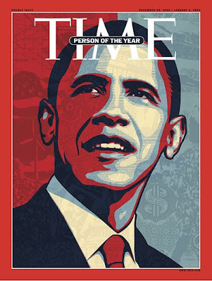 Barack Obama by Shepard Fairey for TIME, 2008
And now the ICA in Boston (so critized above) is on its way to redeeming itself in my eyes by being smart enough to mount the first museum survey of Fairey's work, which opens tomorrow and runs through August 16th.
April 21, 2008
 Bruce Nauman, Double Poke in the Eye II, 1985, neon construction, Kemper Museum of Contemporary Art, Kansas City, Mo.
My post "Impenetrable prose from the Whitney Biennial" clearly hit a nerve, whizzing around the Net in the last couple of weeks before bouncing out into the print media, the subject of “Being at Ease With Difficulty” defended the academic tone by saying, “the blogger culture lends itself to an anti-intellectualism that has its way of raising its heads in a gang.”
The anti-intellectual label is easily hurled, as is the accusation that anyone who suggests that ideas might be rendered in a readable and understandable manner is somehow calling for a “dumbing down.”
So when Hrag Vartanian states, “If the ideas are complex it is because they often grapple with concepts that resist simplification,” I insist on distinguishing between "simplification" and "clarification." It is not necessary to simplify in order to clarify. Further, I'm suspicious of any idea that can’t be clarified.
Anyway, the issue at hand is not about difficult ideas being made simple, but simple ideas being made difficult.
What I’m calling for is not a “dumbing down” but a “smartening up.” I’m asking for readers of the fatuous phrases that litter artists’ statements, press releases, and museum text not to swallow them whole, but ask themselves: “What is this really saying?” “Does it make sense?” And more, “What does it have to do with the art at hand?”
In an email, Janice Gewirtz, a reader of the Wall Street Journal, thanks me for my criticism of what she coined the “Emperor’s New Biennial” and says, further, “These overblown installations say nothing cogent about the subjects they ostensibly tackle. Rather, they reference ‘pop culture,’ or ‘sexuality,’ or even the notorious ‘fluid communication structures’ (whatever that is) as buzzwords.”
Exactly. That's what I was referring to in my posts here and here about Doris Salcedo’s crack in the floor of London’s Tate Modern, which is billed as “addressing a long legacy of racism and colonialism that underlies the modern world.” Sometimes a crack is just a crack.
Idly Googling “artspeak” the other day (procrastination is a wonderful thing), I came across an essay by John Haber, written in 1997, where he nails the origin of this language:
…am I imagining it, or do they blend together—the gallery press release and a parody of management jargon?…. It may have its roots in academia, where scholars hope to share their hesitant insights with students and peers. It may look back to art journals, where critics fumble for words to describe works of art rich in emotions and ideas. However, that is not where artspeak begins, and complaints about it hide its origins all too well.
Worse comes to worse, academics will trip up on their own humanity. Worse comes to worse, they will stumble on insights as unfamiliar and unpronounceable as art itself. Artspeak really starts sometime later, when critical clichés pass through the gallery system and into the marketing departments of major museums, eager for a larger public and bigger institutional gifts.
Promoting art is business, big business, and money talks. I call its language martspeak.
So perhaps now that it’s been defined for us--the language of two industries, academia and the art market, who have joined together for their mutual economic benefit--when we see it, we'll more easily recognize martspeak for what it is.
Haber continues:
Words never contain a work of art. Words can, though, encourage its reconstruction. They can create small openings in the walls that already exist, so that others may begin to look—and to see….
Art asks one to enter into a broken conversation, a half-overheard dialog between the work and the world. Newcomers to art distrust that demand. Most, often, too they would never know how to begin. A critic’s job is to break the ice.”
Something that all of us who write about art—be it our own or that of others—would be wise to remember.