Art Vent

Letting the Fresh Air In

Art Vent Letting the Fresh Air In

November 18, 2014

The HBO documentary, “Banksy Does New York” reviews the anonymous British street artist’s month-long New York “residency” where, in October of 2013, he generated a new work every day for a month, in all five boroughs of the city. In a brief segment of the film, I discuss the artist’s engagement with the writings of Hannah Arendt. The text is part of a lecture, “Banksy: Completed,” in which I follow his clues to reveal the philosophical origins of his work, given in the past year at University of Southern California/Fullerton, the Berkshire Museum, and the University for the Creative Arts in Canterbury, UK.

           ***

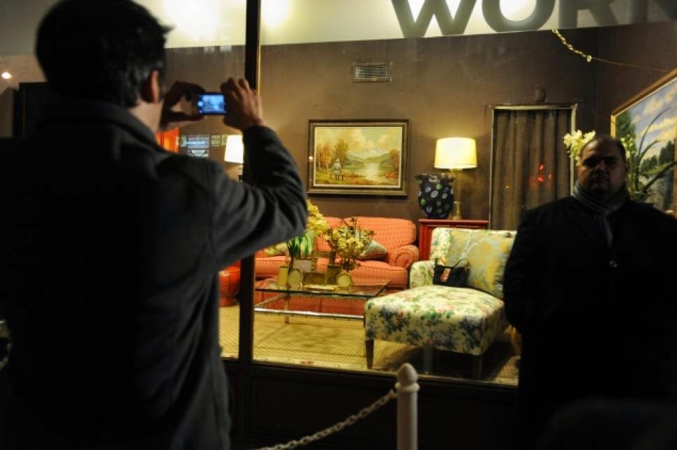
For Day 29 of his unsanctioned sojourn in New York, Banksy repurposed an original artwork, an overwrought pastoral oil painting purchased for $50 from a thrift store. With his painted addition of a solitary Nazi officer seated in contemplation on a bench, the scene of an autumn forest by a river with snowy mountains in the distance is transformed from kitsch Americana to Caspar David Friedrich-esque German Romanticism, the falling yellow leaves now signifying the decline of the Nazi regime as well as a warning, perhaps, of our own social and political decline. Scrawling his signature under that of the original artist, Banksy, on his website (which existed only for the duration of the “residency”), entitled the work "The banality of the banality of evil, oil on oil on canvas, 2013," and described it as "a thrift store painting vandalized then re-donated to the thrift store," with the intention that the proceeds go to the Brooklyn-based nonprofit that benefits homeless people living with HIV/AIDS. Housing Works auctioned it off and ultimately, after much bidding drama, netted at least $450,000.

On the Village Voice blog, writer Raillan Brooks no doubt Googled “the banality of evil” to discover that it was associated with Holocaust survivor and philosopher Hannah Arendt’s “theoretical reckoning of the Nazis' rise to power.” Brooks, concluded, however, that it more likely had “something to do with Banksy not really caring much about what he's actually saying”—when it’s clearly the theme that underlies all his subversive enterprises.

A Report on the Banality of Evil is the subtitle of Arendt’s 1963 book, Eichmann in Jerusalem, an eyewitness account of the Nazi criminal trial of Adolf Eichmann, who was accused of engineering the extermination of European Jews. Writing originally in The New Yorker, Arendt expressed shock that Eichmann did not come across as a monster, but “terribly and terrifyingly normal,” a man whose thinking was so conventional that he spoke only in clichés. This led Arendt to develop her thesis that beyond Hitler’s vile nature, it was the mediocrity of his functionaries, their unwillingness to think for themselves while attempting to fulfill their mundane needs and individual ambitions—hence their banality—that enabled the Nazi atrocities. Therefore Banksy’s title has to do with the original painting being itself a cliché, the work of a painter who is trying to please others rather than thinking for himself, and by inserting the Nazi officer, Banksy is adding a symbol of banality to banality, with his “oil on oil.”

While being tried as a war criminal, Eichmann insisted on his innocence: he never killed anyone or ordered that anyone be killed, nor did he have a grudge against Jews. He was a man eager to get ahead and his job, which he fulfilled efficiently, was to arrange for the transportation of Jewish prisoners to death camps. To do otherwise, he explained on the stand, would be to break the law at the time, and he was not a law-breaker. Their destination was not his responsibility. Upon hearing his sentence of death, Eichmann said, “I am convinced in the depths of my heart that I am being sentenced for the deeds of others.”

This concept is at the heart of Bernhard Schlink’s 1995 novel, The Reader, later made into a film. One of two main characters, Hanna, is being tried for war crime, but she’s not an officer, nothing like it, simply a guard who never considers the possibility that she could defy orders and unlock the burning church in which most of her prisoners die. Like Eichmann, what’s chilling about Hanna is her ordinariness; she’s just doing her job. Arendt suggests that evil is more accidental than intentional, less a result of ideology and conviction than a by-product of petty ambition and the drive for personal security.

Expanding on Arendt’s thesis was Stanley Milgram’s famous psychological experiment that measured the willingness of study participants to obey an authority figure who instructed them to inflict what they thought were electrical shocks on a hidden subject, an actor whose screams they could hear. Milgram concluded that, “Ordinary people, simply doing their jobs, and without any particular hostility on their part, can become agents in a terrible destructive process.... (when) asked to carry out actions incompatible with fundamental standards of morality, relatively few people have the resources needed to resist authority.”

Commenting on this experiment, Banksy has noted, “Garments are symbols of authority and we have a powerful tendency to accept authority….Take the man out of the doctor's costume and his test subjects refuse to do it.”

Ironically, while railing against this failure of humans to question their environment, Banksy consciously uses it to his own ends. Not one to skulk around in a hoodie, as he appears in his 2011 film “Exit Through the Gift Shop,” one of his methods for avoiding detection is to look as official as possible.  To “turn invisible” he recommends a high-vis vest, hardhat, clipboard, and business cards—not to speak of three stories of scaffolding under a CCTV camera.


It is therefore significant that Banksy’s Nazi officer is not depicted as an ogre, but a lover of nature, which makes him all the more normal and therefore frightening. In that context, Banksy’s entire crusade can be seen as one against what Arendt called a “failure to think” or, in other words, mediocrity and banality in all its forms.

The greatest crimes in the world are not committed by people breaking the rules but by people following the rules. It's people who follow orders that drop bombs and massacre villages. As a precaution to ever committing major acts of evil it is our solemn duty never to do what we're told, this is the only way we can be sure.

--Banksy, Wall and Piece.


June 16, 2014
Photo: Dennis Kardon © 2014
 
There’s much that disturbs me about Kara Walker’s much-laudedand wildly popular installationat Brooklyn’s defunct Domino Sugar refinery, but I’ll start with its undeniable beauty. Made of sparkling white sugar, this gigantic, crouching sphinx-like figure, with curves like a Brancusi, looms like a symbol of purity in the vast darkness and decay of the factory’s interior. The sweet smell is overwhelming, and the piece itself is intended to degrade over time; when I was there, skeletal dark lines were beginning to form between the polystyrene blocks that form the core of the sculpture. Conceptually and figuratively, it’s a virtuoso performance that brilliantly fulfills part of nonprofit Creative Time’s original mission to ”support the creation of innovative, site-specific, socially engaged works in the public realm, especially in vacant spaces of historical and architectural interest…while pushing artists beyond their normal boundaries.” [See note below]

 
So why does its beauty upset me? Because the installations’ sheer gorgeousness and spectacle serve as a distraction from the insidious agenda that makes a mockery of another part of Creative Time’s mission, to “foster social progress.”  I have long felt that Walker’s workin which blacks are portrayed as passive victims of slavery engaged in psycho-sexual dramadoesn’t invalidate, but rather reinforces the stereotypes whites have imposed on blacks to justify racism, and is entirely dependent on the gratuitous titillation that violence and sex inevitably engender, regardless of the context—or the race of the person who perpetrates them. Walker’s sphinx conflates two familiar white parodies of black women: the big-assed, sexually available Jezebel, with her vulva hanging out for the taking, and her opposite, the maternal, large-breasted but desexualized Mammy, who sublimates her own needs to fulfill those of her white charges.
 
Vulgar photos taken by visitors posing with the “sphinx” are all over Instagram, and castigated online by writers who are upset that the artwork is not being shown proper respect. Derived from minstrel shows where whites in blackface lampooned blacks, the caricatures Walker appropriates were created with the specific intention of provoking ridicule. Should we then be surprised when they succeed?

 
Roberta Smith in the Times writes that Walker “evokes the history of the sugar trade, its dependence on slavery and slavery’s particular degradation of women, while also illuminating the plagues of obesity and diabetes that keep so many American dreams unfulfilled.” Yet it can also be said that Walker is providing massive advertising for Domino Sugar, which donated the 80 tons that make up the sculpture. As a sponsor, the familiar Domino logo is prominently featured on a wall at the site as well as Creative Time’s website, and a Google search for ‘“Kara Walker” Domino’ garners over 88,000 links. Statements that speak of “history,” along with the fact that Walker’s images are based nostalgically on our antebellum past, present a view of slavery that locates it dangerously outside the present capitalist global economy—when it is still very much part of it.

 
While Creative Time’s website includes a compelling essay written by the narrator of a documentaryabout the forced and child labor that constitute modern slavery, it doesn’t name the mega-corporation that owns Central Romano, the plantation on which it was filmed: Flo-Sun, of which Domino is its best-known subsidiary. If the people at Creative Time, along with Walker, have seen this film—as indeed they must have in their research—I wonder how they feel about the ironic possibility that Walker’s sculpture might have been enabled by slave labor.

 
Pepe and Alfy Fanjul, who run Flo-Sun, inherited the sugar empire from their Cuban father. Dubbed“the Koch brothers of Southern Florida,” they‘re said to be friends and neighbors of the Kochswho, in comparison with the sugar barons, look like Mother Theresa clones.

 
In the Dominican Republic, the Fanjuls have been subject to repeated allegations of labor exploitation, particularly of undocumented Haitian migrant workers with little to no legal standing before Dominican government institutions. The U.S. Department of Labor includes sugar from the Dominican Republic—much of which comes from Fanjul-owned plantations or is imported to Fanjul-owned refineries—on its annual "List of Goods Produced by Child or Forced Labor."Both a 2005 Canadian Broadcasting Company documentary [“The Price of Sugar,” narrated by Paul Newman, view here]and the 2007 film "The Sugar Babies," narrated by Haitian writer Edwidge Danticat [author of the Creative Time essay] call attention to the working conditions of impoverished cane-cutters laboring at the Fanjuls' Central Romana. In the United States, meanwhile, opponents of U.S. agricultural subsidies and government protections have long criticized the Fanjuls for building their dominance in the domestic market on the backs of artificially inflated prices and the U.S. taxpayer…. more

 
Essential reading includes the 2001 Vanity Fair article, “In the Kingdom of Big Sugar,” which inspired the two documentaries, a CNN piece on how the Fanjuls could be the “First Family of Corporate Welfare,” and this on their strong-arm tactics with lawmakers, from Wikileaks.

 
You could spend days, as I did, reading about the moral and ethical transgressions of the Fanjuls, and just when you think it couldn’t get worse, it does: In 2010, the Post’s Page Six reported that Pepe Fanjul’s executive assistant of 35 years is the ex-wife of former KKK leader David Duke, and the current wife of Don Black, a former KKK grand wizard and member of the American Nazi Party. He now runs white-supremacist Web site StormFront.org. A company representative said, “While we may not agree with someone’s politics, we wouldn’t terminate them for that….We will not discriminate against anybody….”

 
One could also make an issue of the extensive advertising Walker is providing for another sponsor, Two Trees Management, owned by Creative Time board member Jed Walentas, who worked for Trump before taking over his father’s real estate business, and will have 1700 luxury apartments to sell in his massive waterfront development on the site (as well as 700 affordable units, the number bumped up under pressure from Mayor de Blasio). And then there’s the non-renewable polystyrene that went into this gigantic temporary work that, like Styrofoam, could take a million years to break down. However next to the question of how the 80 tons of Fanjul sugar were most likely sourced, these are mere quibbles.

 
So much for institutionalized protest—this is art packaged to look like radicalism while supporting capitalism at its worst.

 
Next: “Occupy!” (The Musical), brought to you by Citibank.

 
Photo: Carol Diehl (2014)
***

Note:  I lifted this mission statement from Creative Time’s Wikipedia entry, well aware that it is not same statement that appears on their website. However having been Director of Public Relations (a somewhat hilarious title, given that I was the entire department) for Creative Time in the mid-80’s, when it was a pioneering organization and very true to its nonprofit status, these were the words I used to promote it and feel best represent the inspired vision of founder Anita Contini.

Related reading: The Flying Walentases (on the developers in NY Mag), Marina Budhos's Kara Walker and the Real Sugar Links, and Nicholas Powers, Why I Yelled at the Kara Walker Exhibit
 

January 5, 2014
Just a note to say that I haven’t abandoned blogging, just taking a break after seven years and over 500 posts--and  saving myself for drawing and a bigger project, yet to be unveiled, that’s taking up all of my brain cells. Right now I’m happily ensconced in Los Angeles, soaking up the sun, doing kundalini yoga every day, and thriving in the relaxed atmosphere. I'll work on trying to miss New York, because I’ll be back soon enough.


Happy New Year!


Carol Diehl, 2013, ink and pencil on Bristol, 11 x 14. 
November 3, 2013
If anything, by completely obscuring Frank Lloyd Wright’s architecture with his installation, James Turrell reaffirmed my already profound love for the Guggenheim–like the new appreciation one might have for a healed limb after the cast has been removed.


At the museum Friday for the Christopher Wool exhibition, I was reminded of how Wright created not just a place for art, but for people—a social space in one big room that hums like a party. In most museums the other visitors are annoyances, always in the way, going the wrong direction, talking too loudly or blocking the view—but at the Guggenheim they’re fellow travellers. The ramp is like a sidewalk where you can stop and chat (no need to whisper); it respects your pace. You can see what’s ahead above or across the atrium and get exited about it in advance, stand as close or look as far as you want. What other museum offers a view from over 100 feet?


Plus the natural light that comes in from the skylight at the top….


In the usual rectangular museum gallery, I’m overly conscious of the amount of time I’m spending in front of something, and am always torn – should I be looking at this or this or is there something more interesting behind me? What am I missing? And this time at the Guggenheim, when I exited the ramp to see the paintings installed in the one conventional room, they lost some of their dynamism. I didn’t want to be there, enclosed, with no windows. I wanted to be “outside.”


I not only remember the work in exhibitions I’ve seen at the Guggenheim, I remember where it was situated and how it felt to come upon it—the “uninterrupted, beautiful symphony” of architecture and art Wright intended.


Further, there’s a single toilet or two at every level, so no need to descend to a dungeon and crowd into the usual bathroom horribleness—how civilized is that?


Our forebears made art on the walls of caves with no right angles. I think they had had the right idea.


October 4, 2013

18th Street, between 10th and 11th


Hauser &Wirth, 511 WEst 18th Street

20th Street

Eleventh Avenue

Bortolami Gallery, 520 West 20th Street

Tenth Avenue sidewalk


29th Street between 9h and 10th

29th Street, between 10th and 11th
September 11, 2013
In my previous post about James Turrell at the Guggenheim and  Robert Irwin’s re-installation of Scrim Veil-Black Rectangle-Natural Light, 1977 at the Whitney (June 27-Sept 1, 2013), I suggested that Irwin might have taken Marcel Breuer’s trapezoidal window as his starting point, given that the window’s narrow black frame appeared to share both color and dimension with his long horizontal bar and the painted black stripe that runs, also horizontally, around the walls. When I wrote to the museum for exact measurements, however, I was told “the curators are unaware of any correlation between the dim [frame] on the window and the width of the black stripe.” Knowing the precise observation inherent in Irwin's work, I decided to put the question to the artist himself. In doing so I gained insight into what Irwin was thinking when he first entered the Whitney gallery 35 years ago, and how the philosophy that drove that piece is still at play in his work today. The following is from a phone conversation on September 3, 2013.

Robert Irwin, Scrim Veil-Black Rectangle-Natural Light, 1977 (reinstalled). Photo: Vaughn Tan

CD: I wrote in my post that the window, whose black frame roughly matches the elements you added, appeared to be your starting point. Is that so?


RI: No. The first thing that struck me when I entered the room at the Whitney, was the black floor. Then there’s the ceiling, not handsome, but a factor, and the quality of the light from the window, the way it disintegrates over the length of the space. And, of course, the sheer size of the room – an empty room of that scale is something you don’t generally encounter in New York. The window is the architect’s revenge; the angles are a perfect perspective to the buildings across the street, and it has a pictorial element, which make’s it almost impossible to show a painting there. Most of the time they have to hide the window. The window is a detail, but not a principal one.


Normally when you walk into the room you take a check—the first responsibility of perception is to keep from being killed—so you check coordinates, rapidly. But I did something at the Whitney that doesn’t stand out, which was paint the wall opposite the window a shade that’s considerably brighter than the other walls—if you were to turn a light on in the room at night, you’d see that it was about 65% gray. So when you come in, you know that something’s not quite right, but only subliminally.


The situation was an opportunity to make a statement about the idea of “conditional” —as well as how, and in what way, the conditional acts in world.


What do you mean by “conditional”?


Instead of being in the studio and conceiving things, the artist isolated in the frame, the idea is that the perceiver can deal with the world itself and make all kinds of value judgments, engage the cognitive self to make decisions in the world. I was intrigued by the idea that rather than creating a metaphor, an artist can function directly in the world….


…and eliminate the “frame,” which includes wall text, labels—all the paraphernalia that designates a thing as “art” and separates it from life.


Yes, in my very first show at MoMA, with Jenny Licht back in 1970, they put a label on the wall and I hired someone to come in and take it off. So when you walked into the room you had to go through the process of asking yourself  “Is this thing finished? Is it intended?”


It’s about using the same elements in the museum and the outside world, making something, but not really making anything, just pointing it out. If we take the history of modern art as a question, does “making” equal “art”? Is it necessary to make something or can it be about operating in the world as it is? I just took it one step farther.


The one thing that distinguishes each of my students from the other is an individual sensibility; my job as a teacher is to help them find that key element, and develop it. So I come to a situation and add to that existing dialogue from what’s at the core of my being an artist.


I’m not a landscape designer, but made a garden at the Getty. The same with the design of the Dia:Beacon. I am not an architect.


Getty Garden. iPhone photograph. f/2.8. Copyright (c) Joanne Mason 2011.

I recently had a conversation with an artist, and when I told him you designed the Dia:Beacon, he said, “But there’s nothing there. He didn’t really do anything to it.” He meant that your signature wasn’t on it. I thought you’d like that.


When I consider a space, I don’t have to bring to it other kinds of abstract rationale.

The Dia doesn’t act as a piece of art. When architects design museums, they are creating major pieces of sculpture. In the beginning, they have pure intentions, but when it becomes big business, they start to act as if they’re artists. It’s unethical to build a building that doesn’t function.


So getting back to the Whitney, it can’t be coincidence that the frame around the window matches the bar and painted stripe.


No, of course not. The window is definitely an element in the vocabulary. And there are only a few others in that space: the floor, the disintegration of light over the space, the ceiling. Of those the disintegration of the light was probably the most appealing aspect for me. The light is a subject that goes through this amazing exercise before your eyes, which the scrim then multiplies...sometimes opaque, sometimes transparent.


It’s interesting that your show coincided with Turrell’s at the Guggenheim – both involving space, light, iconic architecture….


But it’s not fair to compare Turrell’s current work with something I did 35 years ago—35 years is a long time in a life. And when I did it, it was like I threw a rock in a pond and there were no ripples. Now it’s a cause célèbre; it just took that amount of time to get back to me. The same with a column I made in 1971, that's just now found a home in the San Diego Federal Courthouse.


I can understand why, though. At the exhibition I saw at Chicago’s MCA in 1975, you did two pieces: the scrim wedge and one that was simply—to my mind at the time—a black bar running around the floor. I was hugely affected by the scrim piece, but it was too early in my life as an artist for me to understand the other. Now I would get it in a flash. Maybe people are just catching up.


Robert Irwin, Museum of Contemporary Art, Chicago, 1975.

Further reading: Carol Diehl, "Robert Irwin: Doors of Perception," Art in America, December, 1999.


August 26, 2013

Every hue throughout your work is altered by every touch you add in other places.

—John Ruskin


The work promotes a state of contemplation in a communal viewing space, rekindling the museum’s founding identity as a “temple of spirit”—Guggenheim Museum press release for James Turrell’s Aten Reign, on view through September 25, 2013.


For the past several weeks I’ve been trying to make sense of my profound underwhelm with James Turrell’s otherwise much-touted light extravaganza at the Guggenheim. I love the Guggenheim; the architecture makes any reason to go there a special event, and now one of my most-admired artists has filled the atrium with a giant hollow cone of light and color which, ovoid and tiered like a wedding cake, floats over a seating area like a flying saucer. Gently diffused by the cone’s scrim-like fabric, LED lights gradually shift from one gradated color to another, while muted natural light filters in through the skylight. What’s not to like?


It should be right up my alley. Turrell’s permanent installation at MoMA/PS1, Meeting (1986) is at the top of my ten best list. In addition, I’ve spent a good part of my professional life writing about Robert Irwinand Olafur Eliasson, who work with perception and light in similar ways. I also have a special affinity with Turrell because I, too, come from Quaker stock and have been a practicing Quaker. Meditation and contemplation are important parts of my life.


However, seated in the atrium at the press preview, instead of going into rapture, I began thinking about Eliasson’s circular 360°Room(s) for all Colors of similarly changing hues. There visitors are highlighted participants, lit like fashion models against a seamless background, where here they appeared to have little relationship with the piece that hovered above them.  I also thought about how, in those Eliasson pieces, you can walk right up to the “wall,” which seems to have no substance but that of color, and practically put your nose in it—while the entire experience Turrell has created at the Guggenheim is “up there.” Not significantly related to the scale of my body, it felt separate from me, which meant I didn’t have the desired heightened awareness of my place in it—I was not, to employ the overused phrase, “seeing myself seeing”—any more than I would at a fireworks display. In every work of art the “here” and “there” are important aspects; to be fully satisfying, I want even a painting to tell me something up close as well as from a distance. In an installation, it’s even more important, because if my situation as a visitor isn’t fully developed, I don’t feel a connection with whatever else is going on.


Olafur Eliasson. 360° room for all colours. 2002. Stainless steel, projection foil, fluorescent lights, wood, and control unit, 126 x 321 x 321" (320 x 815.3 x 815.3 cm). Private collection. Installation view at Musée d'Art moderne de la Ville de Paris. Courtesy Tanya Bonakdar Gallery, New York. © 2008 Olafur Eliasson


The most important aspect, however, of “seeing ourselves seeing” is that our perception is challenged to the point that we no longer trust our normal visual clues. This produces a particular state of self-consciousness that merges with the work—and at this, Turrell has been a master. In his Skyscapes, like the one at PS1, the sky becomes a “thing” you feel you could almost touch, with the result that you find yourself simultaneously questioning it and yourself. And looking at one of his early, simple corner light projections, your brain processes it as a cube with actual mass, even though you know it isn’t.  Nothing like that happens at the Guggenheim; while it’s beautiful, even stunning, there’s no mystery. What you see is what you get—an indication that the line between art and lighting design (which has become extremely sophisticated through the influence of artists) is now very, very thin.


James Turrell, Meeting(1986) MoMA/PS1. Photo: Carol Diehl, 2011


“He’s an orchestrator of experience,” Chuck Close has said of Turrell—but what makes up that experience? Where does it start and stop? Does it begin when you hear about it from a friend, or read a review? Those are things the artist can’t control, but he can influence what happens from the minute you walk through the door.


And what’s that like? My friend, David, a hospital administrator who made the mistake of visiting the Guggenheim with his out-of-town family on a weekend, described it as…“Horrible. Like Disneyland. There were 4-5 lines squeezed into the walled-off lobby, and you’re trying to get in line and bumping into everyone…and once you get your ticket and come into the atrium you’re trying to look up but can’t because there are so many people. It was pretty, but hardly transcendent. The architecture was all covered up and you could have been anywhere. And then, still bumping into people, you walked up the walled-off ramp, which felt like a missed [artistic] opportunity, to stand in more lines. Not that we were looking to be entertained, but we were looking for $20 worth of something.”


Another friend said the guards were ordering people around, telling them to get off the floor if they tried to lay on it….”It’s not their fault,” he said, “They were only doing their job, but it could have been managed better.”


So how much of that has to do with Turrell? I think it all does.


Much to the annoyance of painting students when I refuse to overlook a warped stretcher (the perpetual question being, “Is this intentional?”), I have always contended that everything that falls into my experience is part of the piece—a view that has fueled my no-doubt tedious bloggy diatribes against artists’ statements, wall text, audio tours, black-out curtains, headphones, etc. 


I was irritated when, a few years ago, I found that entrance to a Turrell installation, required shedding my shoes and donning floppy Tyvek protective booties. While surely an over-reaction on the part of one who’s invested too much in her fashion statement, I interpreted this as a power play on the part of the artist (“Really? Part of your piece is to make me look ridiculous?”).


So yes, in my book, the queues, crowd control, and the need for crowd control are all part of it.  This is, after all, the same museum that, in 2010, featured relational aesthetics guru, Tino Seghal, whose piece involved engaging visitors in conversation. After that and many similar, such as Martha Rosler’s garage sale and Marina Abramović’s The Artist is Present, both recently at MoMA, it would be arbitrary to insist that personal interactions are significant in one circumstance, but not in another.


Eliasson (who was largely inspired by Robert Irwin, also my biggest influence, and now both have shaped my thinking) was aware of this responsibility on the part of the artist back in 2003, when he configured his monumental weather project at the Tate Modern. Approaching the institution as a whole, part of his preparation involved talking to members of each of the museum’s departments to discuss how their roles would impact his project.


 Olafur Eliasson, weather project (2003), Tate Modern


Eliasson also configured something that could handle the crowds it brought—which raises a related question: what is the artist’s accountability to the social situation his work is creating and/or occupying? For defenders of Richard Serra’s threatening Tilted Arc, which after much controversy, was ultimately removed from a busy office plaza, the answer was “None.” But much has gone on since 1989, with artists now more aware of, and willing to embrace, the public nature of their work. If relational aesthetics has had a positive impact, it has been to highlight the artist’s role in configuring the entire art experience.


Richard Serra, Tilted Arc (1981)

All of this casts doubt on the decision to turn Frank Lloyd Wright’s soaring masterpiece into a confined area that requires limited entrance—and attempt to create a relatively intimate space in a public institution whose most basic function is to accommodate large numbers of people. Another power play perhaps?


I like to think of “generosity” in terms of public sculpture/installation, as a measure of the number of ways a work may fulfill the artist’s intention to successfully affect his audience. For example, few works are more “generous” than Anish Kapoor’s Cloud Gate in Chicago’s Millennium Park. Installed in 2006 and nicknamed “The Bean” for its shape, this giant organic structure of highly polished stainless steel is engaging day and night, from afar, up close, and even underneath, involves light, reflection, and movement, and is as affective in the presence of crowds as it would be in solitude.

Anish Kapoor, Cloud Gate (2003-6), Chicago.

Anish Kapoor, Cloud Gate (2003-6), video: Carol Diehl (2012).

Anish Kapoor, Cloud Gate (2003-6) View from underneath. Video: Carol Diehl (2012).

This is not to say that art has to be popular or even pleasing, but that it fulfills its purpose on every level. Therefore, if the intention of a piece was about the frustration of not being able to see it, say, then the question of its success would be, was everyone sufficiently frustrated?

Frustration and contemplation, however, do not go together.


Meanwhile, the frustration at the Guggenheim continues even after one leaves the atrium and attempts to see Turrell’s earlier works by joining the crowds to ascend the museum’s curving ramps, now claustrophobic tunnels with “walls” of opaque white fabric that block any view of the atrium. As students know, one of the first questions one asks when evaluating any sculpture is, does it perform equally well from all sides, or does it have a “dead zone?” This is something sculptors like Mark de Suvero and Richard Serra have obviously given a lot of thought to—as did the ancient Greeks. And especially now that sculpture engages the scale and dynamics of architecture, just as with personal interactions, it seems arbitrary to insist that we shouldn’t take the outside of Turrell’s cone into consideration as an integral part of the piece—it was, as my friend, David, put it, a “missed opportunity.”


Unattributed, possibly a Roman copy from the Greek
Opaque white scrim along ramps, blocking views across the rotunda
Photo by

Jenny Holzer, 
ROBERT IRWIN: SCRIM VEIL—BLACK RECTANGLE—NATURAL LIGHT, WHITNEY MUSEUM OF AMERICAN ART, NEW YORK (1977)
JUNE 27–SEPT 1, 2013 Photo: Carol Diehl 2013

PART II Robert Irwin on "Scrim Veil-Black Rectangle-Natural Light (1977)" recently at the Whitney

Further reading:

Roberta Smith on Turrell "New Light Fixture for Famous Rotunda"  and Irwin "Ineffable Emptiness: From Dawn to Dusk"

Gabrielle Selz "Considering Perception: Robert Irwin and James Turrell": a look at their shared history.

Lee Rosenbaum: "Turrell's Skyspace Obscures the Sky"

Blake Gopnik: "Has the Sage Turrell Sold Out?"

Pages