James Turrell
Art Vent Letting the Fresh Air In
November 3, 2013
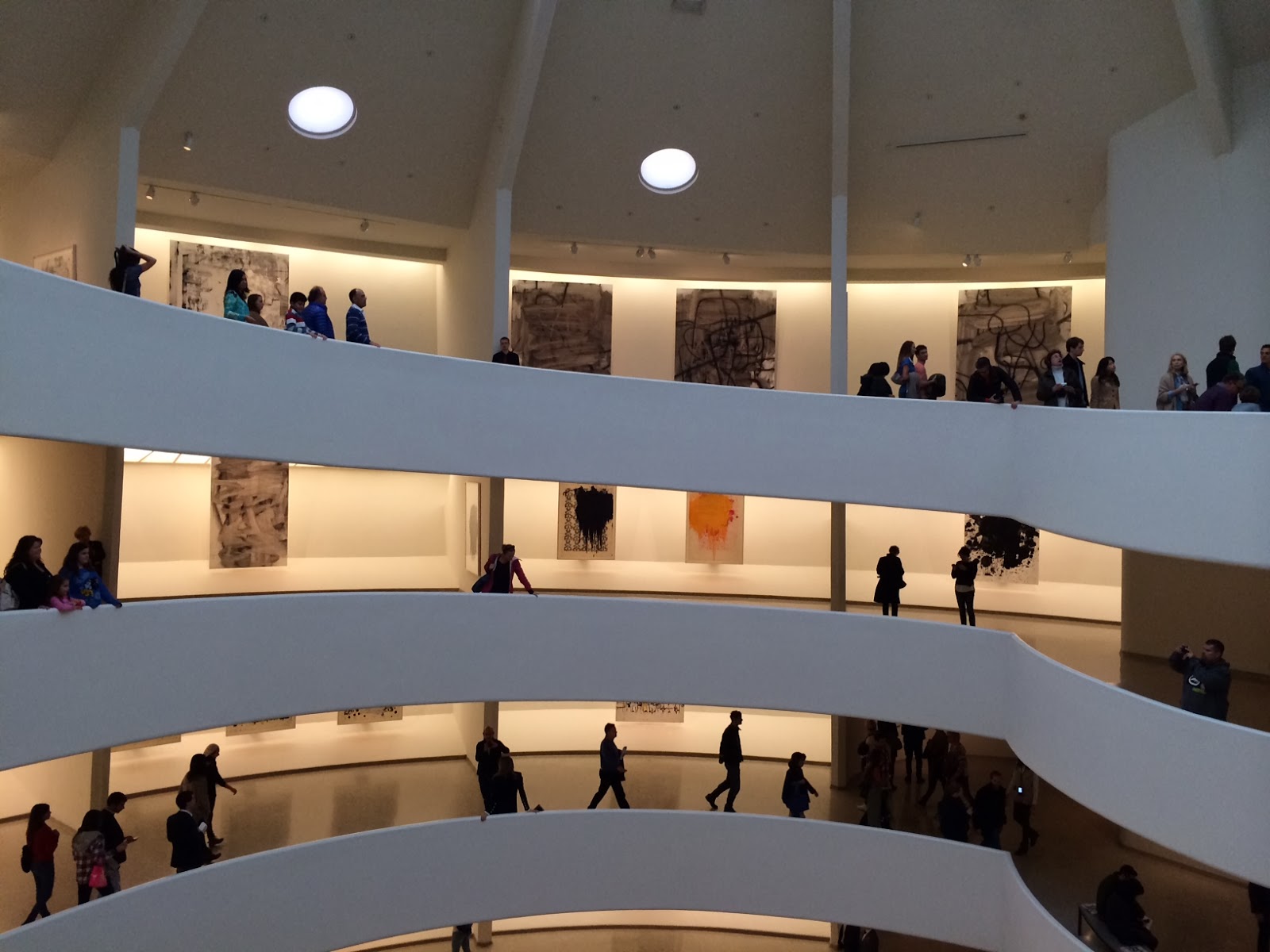
If anything, by completely obscuring Frank Lloyd Wright’s architecture with his installation, James Turrell reaffirmed my already profound love for the Guggenheim–like the new appreciation one might have for a healed limb after the cast has been removed.
At the museum Friday for the Christopher Wool exhibition, I was reminded of how Wright created not just a place for art, but for people—a social space in one big room that hums like a party. In most museums the other visitors are annoyances, always in the way, going the wrong direction, talking too loudly or blocking the view—but at the Guggenheim they’re fellow travellers. The ramp is like a sidewalk where you can stop and chat (no need to whisper); it respects your pace. You can see what’s ahead above or across the atrium and get exited about it in advance, stand as close or look as far as you want. What other museum offers a view from over 100 feet?
Plus the natural light that comes in from the skylight at the top….
In the usual rectangular museum gallery, I’m overly conscious of the amount of time I’m spending in front of something, and am always torn – should I be looking at this or this or is there something more interesting behind me? What am I missing? And this time at the Guggenheim, when I exited the ramp to see the paintings installed in the one conventional room, they lost some of their dynamism. I didn’t want to be there, enclosed, with no windows. I wanted to be “outside.”
I not only remember the work in exhibitions I’ve seen at the Guggenheim, I remember where it was situated and how it felt to come upon it—the “uninterrupted, beautiful symphony” of architecture and art Wright intended.
Further, there’s a single toilet or two at every level, so no need to descend to a dungeon and crowd into the usual bathroom horribleness—how civilized is that?
Our forebears made art on the walls of caves with no right angles. I think they had had the right idea.
Comments (4)
September 11, 2013
In my previous post about James Turrell at the Guggenheim and Robert Irwin’s re-installation of Scrim Veil-Black Rectangle-Natural Light, 1977 at the Whitney (June 27-Sept 1, 2013), I suggested that Irwin might have taken Marcel Breuer’s trapezoidal window as his starting point, given that the window’s narrow black frame appeared to share both color and dimension with his long horizontal bar and the painted black stripe that runs, also horizontally, around the walls. When I wrote to the museum for exact measurements, however, I was told “the curators are unaware of any correlation between the dim [frame] on the window and the width of the black stripe.” Knowing the precise observation inherent in Irwin's work, I decided to put the question to the artist himself. In doing so I gained insight into what Irwin was thinking when he first entered the Whitney gallery 35 years ago, and how the philosophy that drove that piece is still at play in his work today. The following is from a phone conversation on September 3, 2013.

CD: I wrote in my post that the window, whose black frame roughly matches the elements you added, appeared to be your starting point. Is that so?
RI: No. The first thing that struck me when I entered the room at the Whitney, was the black floor. Then there’s the ceiling, not handsome, but a factor, and the quality of the light from the window, the way it disintegrates over the length of the space. And, of course, the sheer size of the room – an empty room of that scale is something you don’t generally encounter in New York. The window is the architect’s revenge; the angles are a perfect perspective to the buildings across the street, and it has a pictorial element, which make’s it almost impossible to show a painting there. Most of the time they have to hide the window. The window is a detail, but not a principal one.
Normally when you walk into the room you take a check—the first responsibility of perception is to keep from being killed—so you check coordinates, rapidly. But I did something at the Whitney that doesn’t stand out, which was paint the wall opposite the window a shade that’s considerably brighter than the other walls—if you were to turn a light on in the room at night, you’d see that it was about 65% gray. So when you come in, you know that something’s not quite right, but only subliminally.
The situation was an opportunity to make a statement about the idea of “conditional” —as well as how, and in what way, the conditional acts in world.
What do you mean by “conditional”?
Instead of being in the studio and conceiving things, the artist isolated in the frame, the idea is that the perceiver can deal with the world itself and make all kinds of value judgments, engage the cognitive self to make decisions in the world. I was intrigued by the idea that rather than creating a metaphor, an artist can function directly in the world….
…and eliminate the “frame,” which includes wall text, labels—all the paraphernalia that designates a thing as “art” and separates it from life.
Yes, in my very first show at MoMA, with Jenny Licht back in 1970, they put a label on the wall and I hired someone to come in and take it off. So when you walked into the room you had to go through the process of asking yourself “Is this thing finished? Is it intended?”
It’s about using the same elements in the museum and the outside world, making something, but not really making anything, just pointing it out. If we take the history of modern art as a question, does “making” equal “art”? Is it necessary to make something or can it be about operating in the world as it is? I just took it one step farther.
The one thing that distinguishes each of my students from the other is an individual sensibility; my job as a teacher is to help them find that key element, and develop it. So I come to a situation and add to that existing dialogue from what’s at the core of my being an artist.
I’m not a landscape designer, but made a garden at the Getty. The same with the design of the Dia:Beacon. I am not an architect.


Getty Garden. iPhone photograph. f/2.8. Copyright (c) Joanne Mason 2011.
I recently had a conversation with an artist, and when I told him you designed the Dia:Beacon, he said, “But there’s nothing there. He didn’t really do anything to it.” He meant that your signature wasn’t on it. I thought you’d like that.
When I consider a space, I don’t have to bring to it other kinds of abstract rationale.
The Dia doesn’t act as a piece of art. When architects design museums, they are creating major pieces of sculpture. In the beginning, they have pure intentions, but when it becomes big business, they start to act as if they’re artists. It’s unethical to build a building that doesn’t function.
So getting back to the Whitney, it can’t be coincidence that the frame around the window matches the bar and painted stripe.
No, of course not. The window is definitely an element in the vocabulary. And there are only a few others in that space: the floor, the disintegration of light over the space, the ceiling. Of those the disintegration of the light was probably the most appealing aspect for me. The light is a subject that goes through this amazing exercise before your eyes, which the scrim then multiplies...sometimes opaque, sometimes transparent.
It’s interesting that your show coincided with Turrell’s at the Guggenheim – both involving space, light, iconic architecture….
But it’s not fair to compare Turrell’s current work with something I did 35 years ago—35 years is a long time in a life. And when I did it, it was like I threw a rock in a pond and there were no ripples. Now it’s a cause célèbre; it just took that amount of time to get back to me. The same with a column I made in 1971, that's just now found a home in the San Diego Federal Courthouse.
I can understand why, though. At the exhibition I saw at Chicago’s MCA in 1975, you did two pieces: the scrim wedge and one that was simply—to my mind at the time—a black bar running around the floor. I was hugely affected by the scrim piece, but it was too early in my life as an artist for me to understand the other. Now I would get it in a flash. Maybe people are just catching up.
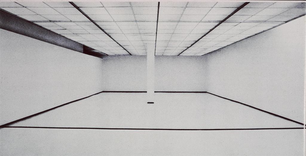
 Robert Irwin, Museum of Contemporary Art, Chicago, 1975.
Further reading: Carol Diehl, "Robert Irwin: Doors of Perception," Art in America, December, 1999.
Further reading: Carol Diehl, "Robert Irwin: Doors of Perception," Art in America, December, 1999.

August 26, 2013
Every hue throughout your work is altered by every touch you add in other places.
—John Ruskin
The work promotes a state of contemplation in a communal viewing space, rekindling the museum’s founding identity as a “temple of spirit”—Guggenheim Museum press release for James Turrell’s Aten Reign, on view through September 25, 2013.
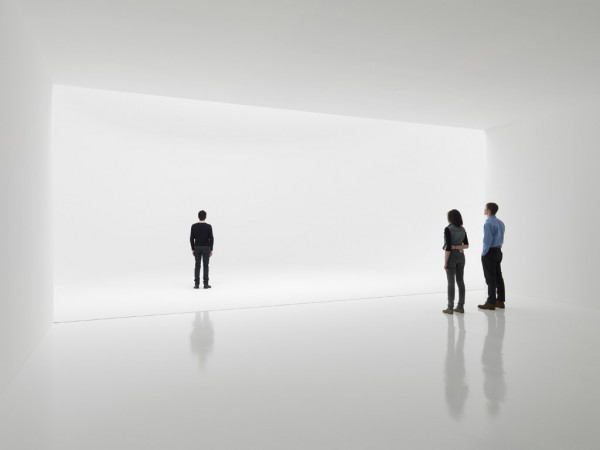
For the past several weeks I’ve been trying to make sense of my profound underwhelm with James Turrell’s otherwise much-touted light extravaganza at the Guggenheim. I love the Guggenheim; the architecture makes any reason to go there a special event, and now one of my most-admired artists has filled the atrium with a giant hollow cone of light and color which, ovoid and tiered like a wedding cake, floats over a seating area like a flying saucer. Gently diffused by the cone’s scrim-like fabric, LED lights gradually shift from one gradated color to another, while muted natural light filters in through the skylight. What’s not to like?
It should be right up my alley. Turrell’s permanent installation at MoMA/PS1, Meeting (1986) is at the top of my ten best list. In addition, I’ve spent a good part of my professional life writing about Robert Irwinand Olafur Eliasson, who work with perception and light in similar ways. I also have a special affinity with Turrell because I, too, come from Quaker stock and have been a practicing Quaker. Meditation and contemplation are important parts of my life.
However, seated in the atrium at the press preview, instead of going into rapture, I began thinking about Eliasson’s circular 360°Room(s) for all Colors of similarly changing hues. There visitors are highlighted participants, lit like fashion models against a seamless background, where here they appeared to have little relationship with the piece that hovered above them. I also thought about how, in those Eliasson pieces, you can walk right up to the “wall,” which seems to have no substance but that of color, and practically put your nose in it—while the entire experience Turrell has created at the Guggenheim is “up there.” Not significantly related to the scale of my body, it felt separate from me, which meant I didn’t have the desired heightened awareness of my place in it—I was not, to employ the overused phrase, “seeing myself seeing”—any more than I would at a fireworks display. In every work of art the “here” and “there” are important aspects; to be fully satisfying, I want even a painting to tell me something up close as well as from a distance. In an installation, it’s even more important, because if my situation as a visitor isn’t fully developed, I don’t feel a connection with whatever else is going on.

Olafur Eliasson. 360° room for all colours. 2002. Stainless steel, projection foil, fluorescent lights, wood, and control unit, 126 x 321 x 321" (320 x 815.3 x 815.3 cm). Private collection. Installation view at Musée d'Art moderne de la Ville de Paris. Courtesy Tanya Bonakdar Gallery, New York. © 2008 Olafur Eliasson
The most important aspect, however, of “seeing ourselves seeing” is that our perception is challenged to the point that we no longer trust our normal visual clues. This produces a particular state of self-consciousness that merges with the work—and at this, Turrell has been a master. In his Skyscapes, like the one at PS1, the sky becomes a “thing” you feel you could almost touch, with the result that you find yourself simultaneously questioning it and yourself. And looking at one of his early, simple corner light projections, your brain processes it as a cube with actual mass, even though you know it isn’t. Nothing like that happens at the Guggenheim; while it’s beautiful, even stunning, there’s no mystery. What you see is what you get—an indication that the line between art and lighting design (which has become extremely sophisticated through the influence of artists) is now very, very thin.

James Turrell, Meeting(1986) MoMA/PS1. Photo: Carol Diehl, 2011
“He’s an orchestrator of experience,” Chuck Close has said of Turrell—but what makes up that experience? Where does it start and stop? Does it begin when you hear about it from a friend, or read a review? Those are things the artist can’t control, but he can influence what happens from the minute you walk through the door.
And what’s that like? My friend, David, a hospital administrator who made the mistake of visiting the Guggenheim with his out-of-town family on a weekend, described it as…“Horrible. Like Disneyland. There were 4-5 lines squeezed into the walled-off lobby, and you’re trying to get in line and bumping into everyone…and once you get your ticket and come into the atrium you’re trying to look up but can’t because there are so many people. It was pretty, but hardly transcendent. The architecture was all covered up and you could have been anywhere. And then, still bumping into people, you walked up the walled-off ramp, which felt like a missed [artistic] opportunity, to stand in more lines. Not that we were looking to be entertained, but we were looking for $20 worth of something.”
Another friend said the guards were ordering people around, telling them to get off the floor if they tried to lay on it….”It’s not their fault,” he said, “They were only doing their job, but it could have been managed better.”
So how much of that has to do with Turrell? I think it all does.
Much to the annoyance of painting students when I refuse to overlook a warped stretcher (the perpetual question being, “Is this intentional?”), I have always contended that everything that falls into my experience is part of the piece—a view that has fueled my no-doubt tedious bloggy diatribes against artists’ statements, wall text, audio tours, black-out curtains, headphones, etc.
I was irritated when, a few years ago, I found that entrance to a Turrell installation, required shedding my shoes and donning floppy Tyvek protective booties. While surely an over-reaction on the part of one who’s invested too much in her fashion statement, I interpreted this as a power play on the part of the artist (“Really? Part of your piece is to make me look ridiculous?”).
So yes, in my book, the queues, crowd control, and the need for crowd control are all part of it. This is, after all, the same museum that, in 2010, featured relational aesthetics guru, Tino Seghal, whose piece involved engaging visitors in conversation. After that and many similar, such as Martha Rosler’s garage sale and Marina Abramović’s The Artist is Present, both recently at MoMA, it would be arbitrary to insist that personal interactions are significant in one circumstance, but not in another.
Eliasson (who was largely inspired by Robert Irwin, also my biggest influence, and now both have shaped my thinking) was aware of this responsibility on the part of the artist back in 2003, when he configured his monumental weather project at the Tate Modern. Approaching the institution as a whole, part of his preparation involved talking to members of each of the museum’s departments to discuss how their roles would impact his project.

Olafur Eliasson, weather project (2003), Tate Modern
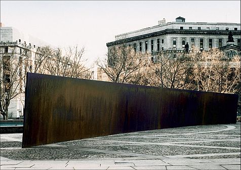
Eliasson also configured something that could handle the crowds it brought—which raises a related question: what is the artist’s accountability to the social situation his work is creating and/or occupying? For defenders of Richard Serra’s threatening Tilted Arc, which after much controversy, was ultimately removed from a busy office plaza, the answer was “None.” But much has gone on since 1989, with artists now more aware of, and willing to embrace, the public nature of their work. If relational aesthetics has had a positive impact, it has been to highlight the artist’s role in configuring the entire art experience.
All of this casts doubt on the decision to turn Frank Lloyd Wright’s soaring masterpiece into a confined area that requires limited entrance—and attempt to create a relatively intimate space in a public institution whose most basic function is to accommodate large numbers of people. Another power play perhaps?
I like to think of “generosity” in terms of public sculpture/installation, as a measure of the number of ways a work may fulfill the artist’s intention to successfully affect his audience. For example, few works are more “generous” than Anish Kapoor’s Cloud Gate in Chicago’s Millennium Park. Installed in 2006 and nicknamed “The Bean” for its shape, this giant organic structure of highly polished stainless steel is engaging day and night, from afar, up close, and even underneath, involves light, reflection, and movement, and is as affective in the presence of crowds as it would be in solitude.
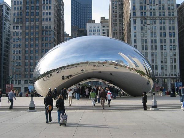
Anish Kapoor, Cloud Gate (2003-6), video: Carol Diehl (2012).
This is not to say that art has to be popular or even pleasing, but that it fulfills its purpose on every level. Therefore, if the intention of a piece was about the frustration of not being able to see it, say, then the question of its success would be, was everyone sufficiently frustrated?
Frustration and contemplation, however, do not go together.
Frustration and contemplation, however, do not go together.
Meanwhile, the frustration at the Guggenheim continues even after one leaves the atrium and attempts to see Turrell’s earlier works by joining the crowds to ascend the museum’s curving ramps, now claustrophobic tunnels with “walls” of opaque white fabric that block any view of the atrium. As students know, one of the first questions one asks when evaluating any sculpture is, does it perform equally well from all sides, or does it have a “dead zone?” This is something sculptors like Mark de Suvero and Richard Serra have obviously given a lot of thought to—as did the ancient Greeks. And especially now that sculpture engages the scale and dynamics of architecture, just as with personal interactions, it seems arbitrary to insist that we shouldn’t take the outside of Turrell’s cone into consideration as an integral part of the piece—it was, as my friend, David, put it, a “missed opportunity.”


Photo by 

Jenny Holzer,

ROBERT IRWIN: SCRIM VEIL—BLACK RECTANGLE—NATURAL LIGHT, WHITNEY MUSEUM OF AMERICAN ART, NEW YORK (1977)
JUNE 27–SEPT 1, 2013 Photo: Carol Diehl 2013PART II Robert Irwin on "Scrim Veil-Black Rectangle-Natural Light (1977)" recently at the Whitney
Further reading:
Roberta Smith on Turrell "New Light Fixture for Famous Rotunda" and Irwin "Ineffable Emptiness: From Dawn to Dusk"
Gabrielle Selz "Considering Perception: Robert Irwin and James Turrell": a look at their shared history.
Lee Rosenbaum: "Turrell's Skyspace Obscures the Sky"
Blake Gopnik: "Has the Sage Turrell Sold Out?"
July 13, 2013
For the first time in almost ever, I took a couple of months off from writing….anything. I was tired of having ideas, tired of the urgency to express them, wanted to concentrate on making art, not thinking about it. Well I found it didn’t pay—just like avoiding the gym doesn’t pay—because now what I’m left with is mental flab and a limp writing muscle. A paragraph that just a few months ago would take five minutes to write, now takes an entire morning—with myriad breaks for coffee and food. Therefore, like not exercising, not writing can be fattening—especially in England, where I am until tomorrow, and where everything goes better with double cream.
Also I hadn’t seen any art that knocked my socks off. The Paul McCarthy show at the Armory put me in such a bad mood, and even the Turrell installation at the Guggenheim, which I wanted to like in the worst way (more about that in another post), left me cold. I fled to Paris, anticipating “Dynamo,” an exhibition of sound and motion at the Grand Palais, but it was the white cheese and passion fruit dessert in the museum café that really turned me on. Sometimes I think I’ve chosen the wrong field.
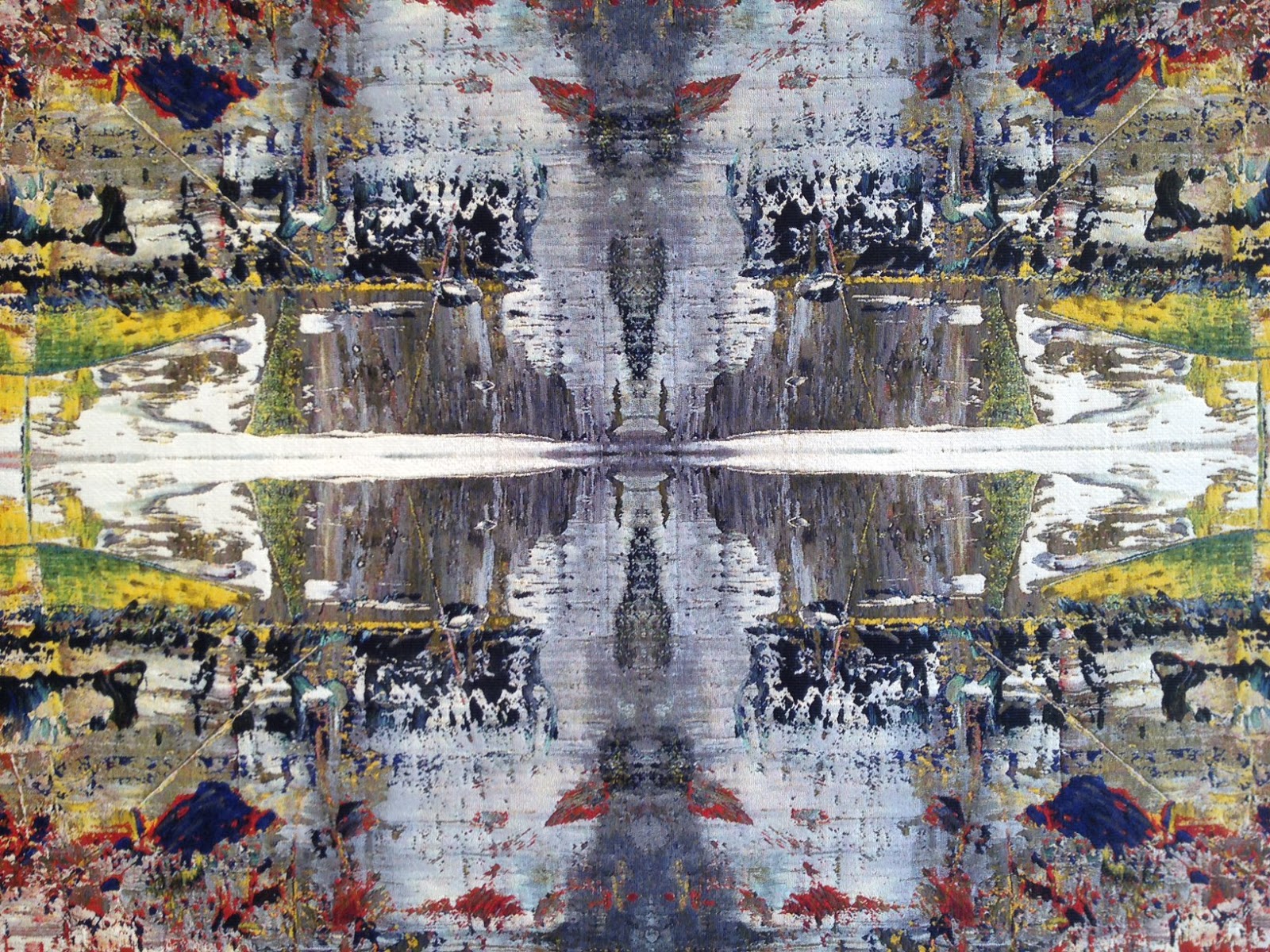
However if anyone can pull me out of a torpor, it’s Gerhard Richter. Usually there’s a lot on in the London summer season, but this year the only thing I really wanted to see was the exhibition(up through July 27) at Gagosian on Davies Street of four Richter tapestries from 2009—which, as it turned out, could be his most magnificent work ever.
The tapestries are based on a single scraped painting: Abstract Painting (724-4) (1990). This is the same one he mined for his book, Patterns: Divided, Mirrored, Repeated(2012), from which he generated the the large-scale digital Strip Paintings, shown at Marian Goodmanlast season, which I reviewed for Art in America.
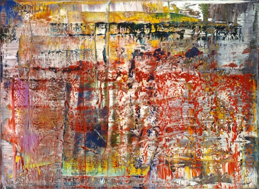
Gerhard Richer, Abstract Painting (724-4) (1990)
Woven on a mechanical jacquard loom, each tapestry represents a Rohrschach-like four-time multiplication of one quadrant of the original image. Dense and rich, they appear at once medieval and futuristic, tribal and Baroque, with varying texture, thick and thin, and colors that range from murky to brilliantly clear.
While my friend and I stood riveted for at least 20 minutes, a couple with a car and driver waiting outside, entered the otherwise empty storefront gallery, walked up to one tapestry, said “Wow!” and walked out.
Although photos cannot possible replicate the experience, here are some attempts (oddly, my iPhone photos have more vibrant color than the official ones):
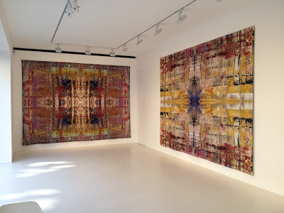 Gerhard Richter, Tapestries, 2009 (Installation view)
 Gerhard Richter, Tapestries, 2009 (Installation view)
 Gerhard Richter, Tapestries (Detail)


March 12, 2012
Sometimes I think it’s my job to be the contrarian, although that hardly applies where Gerhard Richter is concerned. His work and philosophy have long inspired me, so it was a special pleasure to see Corinna Belz’s film, “Gerhard Richter Painting,” which confirmed everything I always wanted to believe about the artist. Belz has great understanding, both visual and intellectual, and strikes just the right note, which films about art hardly ever do. I won’t say more, because I’m most likely reviewing the film elsewhere, except to urge you to see it (even twice, as I did) at Film Forum, where it opens on Wednesday and runs through the 27th.
 Eleanor Antin, The King, 1972 (image from the Web)
 Eleanor Antin, The Angel of Mercy (Florence Nightingale), Myself-1854, 1977 (Image from the Web)
Also I learned, from watching Richter doing interviews in the film, how to answer impossible questions. Which of his painting styles does he prefer? “It varies,” he says. What is his response to fame? “It varies.” So helpful! Now when people ask me how much time I spend in the country or the city, I can say, “It varies.” Which do I enjoy most, painting or writing? “It varies.”
So now for the curmudgeon part—are you sitting down? Prepared for a terrible shock? Okay, here goes…I am not a fan of Cindy Sherman. This is almost as huge as admitting I liked some of Damien Hirst’s spots, but I have always thought of Sherman’s work not as feminist, but anti-female, even mocking—clichés of women as established by the male world. Unlike the women I care about, her permutations are not warm, nurturing, sympathetic, or even sexual. Would you choose any of them to be your best friend? I didn’t think so.
I may also be prejudiced because I remember how, just before Sherman made her film stills in the seventies, Eleanor Antin was transforming herself in photographs in ways that were more haunting, funny, varied and complex—as well as more human. Where Antin was clearly on a quest for self-knowledge, Sherman’s portraits come off as unflattering commentary on the aspirations and ways of life of others--especially in this series, which still strikes me as ageist, sexist, and just plain mean. (I’m plagiarizing myself here, as I wrote about this in an earlier post.)

And on, curmudgeonly, to Doug Wheeler’s sleeper show of the year, which had people braving the winter chill, lining up around the block to be admitted into the David Zwirner gallery, five at a time. Before going further, I want to make it clear that I found the piece admirable, and waited to write about it because I didn’t want to interfere with anyone’s experience of it. If there’s a single form of art that has engaged me to the point of indefatigable research, it's this, “light and space” as it is called, the art of atmospheric environment, as exemplified by the work of Robert Irwin, Olafur Eliasson, James Turrell—as well as Fred Sandback, whose work, though not directly involved with light, engages the viewer in similar ways.
One of the things that impressed me most about Olafur’s famous weather project at the Tate Modern, is how he gave thought to every aspect of the experience, from the pre-publicity and catalogue (neither of which contained images or descriptions of the work, to the length of its run (when asked by the museum to keep it up longer, he refused). Through my study of his work I took on this hyper-criticality, which has contributed to my campaign against artist’s statements and museum wall text, as they often to serve to direct and limit how work is experienced. So, for instance, while I admire Turrell, I began to see his requirement that viewers remove their shoes and put on Tyvek booties before entering certain installations, as a not only part of the experience, but an unpleasant one—even a form of subjugation on the artist’s part, as they make you look stupid.
I also dislike having to circumvent black curtains or don headphones.
So for me, the Doug Wheeler experience began with Ken Johnson’s rave review in the Times, after which everyone was talking about it, then the happily chatty and anticipatory cue along West 19thStreet, which began forming at least a half hour before the gallery opened. Once being allowed to enter the building, five at a time (throughout we were attended by a bevy of friendly, courteous gallery assistants, each more beautiful than the next), we were ushered into a room to wait our turn, sitting on wooden folding chairs (or in my case, a scarily wobbly shared bench next to the wall) arranged in a square so that we faced each other, as in Quaker meeting.
From there, again five at a time, we were invited leave our bags in a pile, take off our shoes and put on white booties similar to Turrell’s, which folded around our ankles like oversize institutional house slippers.
But then there was the space Wheeler created. With no evidence of floor, ceiling, or walls, it was like being suspended in air. When we went in, the slowly changing light was white. I tiptoed as far as I could go, stopping, as instructed, when the floor sloped up, and stood immersed, as if by fog.
My friend, Roberto, remarked that it was like being in heaven.
 Photo: David Zwirner Gallery
Heaven, yes, but with refugees from an insane asylum, as everyone was moving slowly and their booties caused them to shuffle. The effect of the lighting was so much like that of seamless photography background paper that everyone looked like part of a fashion shoot, and thus highlighted became inadvertent performers.
Roberto and I became fascinated with a young woman in our midst who was shuffling about in a particularly distracted way. Everything about her was slack—her mouth hung slightly open, rumpled clothing fell loosely over her heavy frame, and her hair looked as if she just gotten out of bed—in marked contrast to the art students she came with and the fashionable gallerinas. Roberto dubbed her Sloppy Girl. “Meds,” he whispered to me. Who was she? What was she doing there? Was she going to be okay?
Ultimately Sloppy Girl is what we remember and still talk about—not, perhaps what the artist intended.
(Also note that the people in the publicity shot above, courtesy of the gallery, are NOT wearing booties.)
(Also note that the people in the publicity shot above, courtesy of the gallery, are NOT wearing booties.)
October 29, 2011
A few nights ago, I had a dream where I was floating and diving underwater like a dolphin and—as when swimming in real life—I never wanted to stop.
Yesterday I had an art day like that: long, solitary experiences with four very different kinds of work that invited endless immersion. Whenever, as happens all too frequently, I start to wonder why I’m in this field, I can look back on this day and remember why.
 |
| Photo: courtesy MoMA. |
Willem de Kooning, Pirate (Untitled II), 1981
Oil on canvas
7' 4" x 6' 4 3/4" (223.4 x 194.4 cm)
The Museum of Modern Art, New York. Sidney and Harriet Janis Collection Fund, 1982
© 2011 The Willem de Kooning Foundation / Artists Rights Society (ARS), New York
7' 4" x 6' 4 3/4" (223.4 x 194.4 cm)
The Museum of Modern Art, New York. Sidney and Harriet Janis Collection Fund, 1982
© 2011 The Willem de Kooning Foundation / Artists Rights Society (ARS), New York
I got to MoMA early to see the de Kooning exhibition again, this time on my own, and went straight to the back in advance of the hoards with their walkie-talkies. Except for the guard, I was alone in front of de Kooning’s Pirate (Untitled II), and the longer I stood there, the more it revealed to me. The experience was so animated it was like watching TV, only better. After about twenty minutes the guard, an older black man, came up and said, quietly, “Looks as if you like that painting.” I asked him how he felt about it, seeing it day after day—did it hold up?—and he was enthusiastic and knowledgeable. I told him how much I love the wispy late work, as opposed to the ones with looping closed lines, which feel static and tight. The guard pointed out that they were the very last ones de Kooning painted, and suggested that perhaps by then the artist’s mind really was gone. He showed me the area he liked best, a wall of somewhat earlier large abstractions that reminded him of Lee Krasner, and told me, proudly, that he’d worked at MoMA for more than twenty years.
 |
| Photo: Carol Diehl, 2011 |
JANET CARDIFF (Canadian, b. 1957)
The Forty Part Motet (2001)
Reworking of “Spem in Alium Nunquam habui”(1575), by
Thomas Tallis
40-track sound recording (14:00 minutes), 40 speakers
Dimensions variable
The Museum of Modern Art, New York. Gift of Jo Carole and
Ronald S. Lauder in memory of Rolf Hoffmann, 2002
I could have stopped there, completely fulfilled, but instead I took the E out to PS 1 (only two stops from MoMA). While I’ll do almost anything to avoid 9/11 nostalgia, Sasha Frere-Jones, in a recent New Yorker article, mentioned the Janet Cardiff sound installation from 2001, The Forty-Part Motet, which is part of PS 1's September 11 exhibition, and I was eager to experience it. Frere-Jones wrote:
I’ve been a fan of Cardiff's ever since the percussive piece she and George Bures Miller installed in 2006 at Philadelphia's Eastern State Penitentiary, which gets my all-time favorite award for site-specific art (read my review here). Happily The Forty-Part Motet lived up to my expectations—was exalted and exhalting. I could have just as easily been in Canterbury Cathedral during Evensong, but there’s also something about the anonymity of the experience that makes it surprisingly personal. While I was there, two young women were inspired to dance, but attempting to photograph them (with their permission), I was sharply remonstrated by the guard—an action that was jarring and surprisingly upsetting in the way it pierced a euphoric moment. Something like that would never have happened in Europe, I thought, especially in England where museum attendants can be sensitive to the point of being apologetic. So I left the room and came back again later when—with the exception of a different guard who lurked quietly in the corner, absorbed in his cell phone—I was able to listen to the whole thing again, this time completely alone.
Cardiff re-created the performance of a forty-member choir, each singer emerging through a separate speaker, performing the 1573 Thomas Tallis piece “Spem in alium.” In eleven minutes, it uses a stunning variety of overlapping, interlocking parts, as deft in its repetition as anything Steve Reich has done. The interplay of the voices is also moving—I have rarely visited the work and not seen people crying within minutes.
I’ve been a fan of Cardiff's ever since the percussive piece she and George Bures Miller installed in 2006 at Philadelphia's Eastern State Penitentiary, which gets my all-time favorite award for site-specific art (read my review here). Happily The Forty-Part Motet lived up to my expectations—was exalted and exhalting. I could have just as easily been in Canterbury Cathedral during Evensong, but there’s also something about the anonymity of the experience that makes it surprisingly personal. While I was there, two young women were inspired to dance, but attempting to photograph them (with their permission), I was sharply remonstrated by the guard—an action that was jarring and surprisingly upsetting in the way it pierced a euphoric moment. Something like that would never have happened in Europe, I thought, especially in England where museum attendants can be sensitive to the point of being apologetic. So I left the room and came back again later when—with the exception of a different guard who lurked quietly in the corner, absorbed in his cell phone—I was able to listen to the whole thing again, this time completely alone.
 |
| Photo: Carol Diehl, 2011. |
JAMES TURRELL (American, b. 1943)
Meeting (1986)
Interior fluorescent light and open sky
Room: 259 x 279 ½ inches (657.9 x 709.3 cm);
portal: 157 x 177 inches (398.8 x 449.6 cm)
Long-term installation, MoMA PS1, Long Island City,
New York
Where I went to recuperate was James Turrell’s Meeting (1986), unexpectedly open in the early afternoon where, for more than a half hour, I was alone in one of my favorite places in the world. At one point a man opened the door, stuck his head in, and immediately left, having had his fill—but that was all. The sky “ceiling” was picturesquely blue and wisped with clouds on that sunny day, while soft, cool breezes wafted about the room. Perfect.
 |
| Photo: courtesy MoMA, PS 1 |
BARBARA KRUGER (American, b. 1945)
Untitled (Questions) (1991)
Photographic silkscreen on vinyl
66 3/16 x 92 5/8 x 2 1/2 inches (168.1 x 235.3 x 6.4 cm)
Marieluise Hessel Collection, Hessel Museum of Art, Center for
Curatorial Studies, Bard College, Annandale-on-Hudson, New
York.
On my way out of the September 11 exhibition I passed this piece from 1991 by Barbara Kruger. While I didn’t spend half an hour communing with it, it’s stayed with me, as it seems particularly relevant to the present time. If I haven’t posted lately, it’s because I’ve been caught up in the issues around Occupy Wall Street, without quite knowing how to process them as far as my blog was concerned. With the mainstream press reporting so little in the beginning, Facebook became my news source. Suddenly I was grateful that I’d accepted as “friends” over 1,000 people I don’t know, and their links to video footage, news reports from outside the country, and on-the-spot commentary, was riveting, inspiring, and disturbing. The actions of the police, in one scary videotaped scene after another—especially in Oakland—are unconscionable. If this were China, we’d be appalled. Why do we accept it as business-as-usual in a country that gives lip service to free speech and human rights? Now that it’s turned on us in a big way, we can see what the black community has known all along, that police forces are often made up of people who are excited by violence, who can’t wait to use their authority against such dire threats as Citibank customers endeavoring to close their accounts, or Naomi Wolf in her evening dress (an event that made the headlines in The Guardian, which I subscribe to online, but was significantly left out of the New York Times). Not to speak of the group that's most armed and dangerous: nurses.
I’m just enough of a Quaker, an idealist—and an American—to believe, like Marine veteran Sergeant Shamar Thomas in the now-famous video where he successfully talks down a bunch of cops, that the police should be protecting our Constitutional right “peaceably to assemble, and to petition the Government for a redress of grievances.” Is that really so far-fetched?
June 25, 2008
 James Turrell's Roden Crater
Thanks to “Pretty Lady,” “Spatula,” and CAP for comments on my last Whitney post that are worthy of being posts in themselves. While, CAP, I was perhaps too casual in saying “anything can be art,” I actually do believe that, at this point in time, anything someone makes or designates can be (note I said can be, not should be) considered art, and that recognizing this was a necessary step to get us away from the painting-on-a-wall, sculpture-on-a-pedestal mindset that pervaded the first half of the 20th century. I do not agree with “Spatula” that “we have gone too far in deconstruction” since I’m one who delights in art that uses an economy of means (Irwin, Turrell, Eliasson, and a moment of silence in a Sigur Ros concert) to achieve great ends.
However along with deconstruction, we lost our ability to discern. We went rollicking off in the other direction, making deconstruction an excuse for sloppy thinking, sloppy execution, sloppy everything. And I lay much of the blame for this on the proliferation of art schools who profit by making everybody think art is easier than it is, who in order to exist, need the majority of students to come away with a positive experience. I remember a final graduate crit at SVA, when I said to a student about her sculpture, “There’s a lifetime of work to be mined from this”—thinking that I was giving her my highest praise—and she burst into tears because to her mind, she was finished. This was it. What, she’d have to do more?
However I believe the resounding failure of the Whitney Biennial marks the beginning of the end of a too-long era. It goes along with the political scene. We want substance. As with the Iraq war, SUVs, and Froot Loops, we’re not inclined to think something is good for us just because the powers that be say it’s so. I’m encouraged by the fact that I’ve seen more good art in the past six months than in the last ten years put together—and that we’re having these conversations. Before when I saw stuff like Fritz Haeg's Animal Estates or the Whitney’s publicity I thought that I was the only one who thought it was ridiculous. It’s a relief to learn that I’m not alone.