Art Vent

Letting the Fresh Air In

Robert Irwin

Art Vent Letting the Fresh Air In

September 11, 2013
In my previous post about James Turrell at the Guggenheim and  Robert Irwin’s re-installation of Scrim Veil-Black Rectangle-Natural Light, 1977 at the Whitney (June 27-Sept 1, 2013), I suggested that Irwin might have taken Marcel Breuer’s trapezoidal window as his starting point, given that the window’s narrow black frame appeared to share both color and dimension with his long horizontal bar and the painted black stripe that runs, also horizontally, around the walls. When I wrote to the museum for exact measurements, however, I was told “the curators are unaware of any correlation between the dim [frame] on the window and the width of the black stripe.” Knowing the precise observation inherent in Irwin's work, I decided to put the question to the artist himself. In doing so I gained insight into what Irwin was thinking when he first entered the Whitney gallery 35 years ago, and how the philosophy that drove that piece is still at play in his work today. The following is from a phone conversation on September 3, 2013.

Robert Irwin, Scrim Veil-Black Rectangle-Natural Light, 1977 (reinstalled). Photo: Vaughn Tan

CD: I wrote in my post that the window, whose black frame roughly matches the elements you added, appeared to be your starting point. Is that so?


RI: No. The first thing that struck me when I entered the room at the Whitney, was the black floor. Then there’s the ceiling, not handsome, but a factor, and the quality of the light from the window, the way it disintegrates over the length of the space. And, of course, the sheer size of the room – an empty room of that scale is something you don’t generally encounter in New York. The window is the architect’s revenge; the angles are a perfect perspective to the buildings across the street, and it has a pictorial element, which make’s it almost impossible to show a painting there. Most of the time they have to hide the window. The window is a detail, but not a principal one.


Normally when you walk into the room you take a check—the first responsibility of perception is to keep from being killed—so you check coordinates, rapidly. But I did something at the Whitney that doesn’t stand out, which was paint the wall opposite the window a shade that’s considerably brighter than the other walls—if you were to turn a light on in the room at night, you’d see that it was about 65% gray. So when you come in, you know that something’s not quite right, but only subliminally.


The situation was an opportunity to make a statement about the idea of “conditional” —as well as how, and in what way, the conditional acts in world.


What do you mean by “conditional”?


Instead of being in the studio and conceiving things, the artist isolated in the frame, the idea is that the perceiver can deal with the world itself and make all kinds of value judgments, engage the cognitive self to make decisions in the world. I was intrigued by the idea that rather than creating a metaphor, an artist can function directly in the world….


…and eliminate the “frame,” which includes wall text, labels—all the paraphernalia that designates a thing as “art” and separates it from life.


Yes, in my very first show at MoMA, with Jenny Licht back in 1970, they put a label on the wall and I hired someone to come in and take it off. So when you walked into the room you had to go through the process of asking yourself  “Is this thing finished? Is it intended?”


It’s about using the same elements in the museum and the outside world, making something, but not really making anything, just pointing it out. If we take the history of modern art as a question, does “making” equal “art”? Is it necessary to make something or can it be about operating in the world as it is? I just took it one step farther.


The one thing that distinguishes each of my students from the other is an individual sensibility; my job as a teacher is to help them find that key element, and develop it. So I come to a situation and add to that existing dialogue from what’s at the core of my being an artist.


I’m not a landscape designer, but made a garden at the Getty. The same with the design of the Dia:Beacon. I am not an architect.


Getty Garden. iPhone photograph. f/2.8. Copyright (c) Joanne Mason 2011.

I recently had a conversation with an artist, and when I told him you designed the Dia:Beacon, he said, “But there’s nothing there. He didn’t really do anything to it.” He meant that your signature wasn’t on it. I thought you’d like that.


When I consider a space, I don’t have to bring to it other kinds of abstract rationale.

The Dia doesn’t act as a piece of art. When architects design museums, they are creating major pieces of sculpture. In the beginning, they have pure intentions, but when it becomes big business, they start to act as if they’re artists. It’s unethical to build a building that doesn’t function.


So getting back to the Whitney, it can’t be coincidence that the frame around the window matches the bar and painted stripe.


No, of course not. The window is definitely an element in the vocabulary. And there are only a few others in that space: the floor, the disintegration of light over the space, the ceiling. Of those the disintegration of the light was probably the most appealing aspect for me. The light is a subject that goes through this amazing exercise before your eyes, which the scrim then multiplies...sometimes opaque, sometimes transparent.


It’s interesting that your show coincided with Turrell’s at the Guggenheim – both involving space, light, iconic architecture….


But it’s not fair to compare Turrell’s current work with something I did 35 years ago—35 years is a long time in a life. And when I did it, it was like I threw a rock in a pond and there were no ripples. Now it’s a cause célèbre; it just took that amount of time to get back to me. The same with a column I made in 1971, that's just now found a home in the San Diego Federal Courthouse.


I can understand why, though. At the exhibition I saw at Chicago’s MCA in 1975, you did two pieces: the scrim wedge and one that was simply—to my mind at the time—a black bar running around the floor. I was hugely affected by the scrim piece, but it was too early in my life as an artist for me to understand the other. Now I would get it in a flash. Maybe people are just catching up.


Robert Irwin, Museum of Contemporary Art, Chicago, 1975.

Further reading: Carol Diehl, "Robert Irwin: Doors of Perception," Art in America, December, 1999.


August 26, 2013

Every hue throughout your work is altered by every touch you add in other places.

—John Ruskin


The work promotes a state of contemplation in a communal viewing space, rekindling the museum’s founding identity as a “temple of spirit”—Guggenheim Museum press release for James Turrell’s Aten Reign, on view through September 25, 2013.


For the past several weeks I’ve been trying to make sense of my profound underwhelm with James Turrell’s otherwise much-touted light extravaganza at the Guggenheim. I love the Guggenheim; the architecture makes any reason to go there a special event, and now one of my most-admired artists has filled the atrium with a giant hollow cone of light and color which, ovoid and tiered like a wedding cake, floats over a seating area like a flying saucer. Gently diffused by the cone’s scrim-like fabric, LED lights gradually shift from one gradated color to another, while muted natural light filters in through the skylight. What’s not to like?


It should be right up my alley. Turrell’s permanent installation at MoMA/PS1, Meeting (1986) is at the top of my ten best list. In addition, I’ve spent a good part of my professional life writing about Robert Irwinand Olafur Eliasson, who work with perception and light in similar ways. I also have a special affinity with Turrell because I, too, come from Quaker stock and have been a practicing Quaker. Meditation and contemplation are important parts of my life.


However, seated in the atrium at the press preview, instead of going into rapture, I began thinking about Eliasson’s circular 360°Room(s) for all Colors of similarly changing hues. There visitors are highlighted participants, lit like fashion models against a seamless background, where here they appeared to have little relationship with the piece that hovered above them.  I also thought about how, in those Eliasson pieces, you can walk right up to the “wall,” which seems to have no substance but that of color, and practically put your nose in it—while the entire experience Turrell has created at the Guggenheim is “up there.” Not significantly related to the scale of my body, it felt separate from me, which meant I didn’t have the desired heightened awareness of my place in it—I was not, to employ the overused phrase, “seeing myself seeing”—any more than I would at a fireworks display. In every work of art the “here” and “there” are important aspects; to be fully satisfying, I want even a painting to tell me something up close as well as from a distance. In an installation, it’s even more important, because if my situation as a visitor isn’t fully developed, I don’t feel a connection with whatever else is going on.


Olafur Eliasson. 360° room for all colours. 2002. Stainless steel, projection foil, fluorescent lights, wood, and control unit, 126 x 321 x 321" (320 x 815.3 x 815.3 cm). Private collection. Installation view at Musée d'Art moderne de la Ville de Paris. Courtesy Tanya Bonakdar Gallery, New York. © 2008 Olafur Eliasson


The most important aspect, however, of “seeing ourselves seeing” is that our perception is challenged to the point that we no longer trust our normal visual clues. This produces a particular state of self-consciousness that merges with the work—and at this, Turrell has been a master. In his Skyscapes, like the one at PS1, the sky becomes a “thing” you feel you could almost touch, with the result that you find yourself simultaneously questioning it and yourself. And looking at one of his early, simple corner light projections, your brain processes it as a cube with actual mass, even though you know it isn’t.  Nothing like that happens at the Guggenheim; while it’s beautiful, even stunning, there’s no mystery. What you see is what you get—an indication that the line between art and lighting design (which has become extremely sophisticated through the influence of artists) is now very, very thin.


James Turrell, Meeting(1986) MoMA/PS1. Photo: Carol Diehl, 2011


“He’s an orchestrator of experience,” Chuck Close has said of Turrell—but what makes up that experience? Where does it start and stop? Does it begin when you hear about it from a friend, or read a review? Those are things the artist can’t control, but he can influence what happens from the minute you walk through the door.


And what’s that like? My friend, David, a hospital administrator who made the mistake of visiting the Guggenheim with his out-of-town family on a weekend, described it as…“Horrible. Like Disneyland. There were 4-5 lines squeezed into the walled-off lobby, and you’re trying to get in line and bumping into everyone…and once you get your ticket and come into the atrium you’re trying to look up but can’t because there are so many people. It was pretty, but hardly transcendent. The architecture was all covered up and you could have been anywhere. And then, still bumping into people, you walked up the walled-off ramp, which felt like a missed [artistic] opportunity, to stand in more lines. Not that we were looking to be entertained, but we were looking for $20 worth of something.”


Another friend said the guards were ordering people around, telling them to get off the floor if they tried to lay on it….”It’s not their fault,” he said, “They were only doing their job, but it could have been managed better.”


So how much of that has to do with Turrell? I think it all does.


Much to the annoyance of painting students when I refuse to overlook a warped stretcher (the perpetual question being, “Is this intentional?”), I have always contended that everything that falls into my experience is part of the piece—a view that has fueled my no-doubt tedious bloggy diatribes against artists’ statements, wall text, audio tours, black-out curtains, headphones, etc. 


I was irritated when, a few years ago, I found that entrance to a Turrell installation, required shedding my shoes and donning floppy Tyvek protective booties. While surely an over-reaction on the part of one who’s invested too much in her fashion statement, I interpreted this as a power play on the part of the artist (“Really? Part of your piece is to make me look ridiculous?”).


So yes, in my book, the queues, crowd control, and the need for crowd control are all part of it.  This is, after all, the same museum that, in 2010, featured relational aesthetics guru, Tino Seghal, whose piece involved engaging visitors in conversation. After that and many similar, such as Martha Rosler’s garage sale and Marina Abramović’s The Artist is Present, both recently at MoMA, it would be arbitrary to insist that personal interactions are significant in one circumstance, but not in another.


Eliasson (who was largely inspired by Robert Irwin, also my biggest influence, and now both have shaped my thinking) was aware of this responsibility on the part of the artist back in 2003, when he configured his monumental weather project at the Tate Modern. Approaching the institution as a whole, part of his preparation involved talking to members of each of the museum’s departments to discuss how their roles would impact his project.


 Olafur Eliasson, weather project (2003), Tate Modern


Eliasson also configured something that could handle the crowds it brought—which raises a related question: what is the artist’s accountability to the social situation his work is creating and/or occupying? For defenders of Richard Serra’s threatening Tilted Arc, which after much controversy, was ultimately removed from a busy office plaza, the answer was “None.” But much has gone on since 1989, with artists now more aware of, and willing to embrace, the public nature of their work. If relational aesthetics has had a positive impact, it has been to highlight the artist’s role in configuring the entire art experience.


Richard Serra, Tilted Arc (1981)

All of this casts doubt on the decision to turn Frank Lloyd Wright’s soaring masterpiece into a confined area that requires limited entrance—and attempt to create a relatively intimate space in a public institution whose most basic function is to accommodate large numbers of people. Another power play perhaps?


I like to think of “generosity” in terms of public sculpture/installation, as a measure of the number of ways a work may fulfill the artist’s intention to successfully affect his audience. For example, few works are more “generous” than Anish Kapoor’s Cloud Gate in Chicago’s Millennium Park. Installed in 2006 and nicknamed “The Bean” for its shape, this giant organic structure of highly polished stainless steel is engaging day and night, from afar, up close, and even underneath, involves light, reflection, and movement, and is as affective in the presence of crowds as it would be in solitude.

Anish Kapoor, Cloud Gate (2003-6), Chicago.

Anish Kapoor, Cloud Gate (2003-6), video: Carol Diehl (2012).

Anish Kapoor, Cloud Gate (2003-6) View from underneath. Video: Carol Diehl (2012).

This is not to say that art has to be popular or even pleasing, but that it fulfills its purpose on every level. Therefore, if the intention of a piece was about the frustration of not being able to see it, say, then the question of its success would be, was everyone sufficiently frustrated?

Frustration and contemplation, however, do not go together.


Meanwhile, the frustration at the Guggenheim continues even after one leaves the atrium and attempts to see Turrell’s earlier works by joining the crowds to ascend the museum’s curving ramps, now claustrophobic tunnels with “walls” of opaque white fabric that block any view of the atrium. As students know, one of the first questions one asks when evaluating any sculpture is, does it perform equally well from all sides, or does it have a “dead zone?” This is something sculptors like Mark de Suvero and Richard Serra have obviously given a lot of thought to—as did the ancient Greeks. And especially now that sculpture engages the scale and dynamics of architecture, just as with personal interactions, it seems arbitrary to insist that we shouldn’t take the outside of Turrell’s cone into consideration as an integral part of the piece—it was, as my friend, David, put it, a “missed opportunity.”


Unattributed, possibly a Roman copy from the Greek
Opaque white scrim along ramps, blocking views across the rotunda
Photo by

Jenny Holzer, 
ROBERT IRWIN: SCRIM VEIL—BLACK RECTANGLE—NATURAL LIGHT, WHITNEY MUSEUM OF AMERICAN ART, NEW YORK (1977)
JUNE 27–SEPT 1, 2013 Photo: Carol Diehl 2013

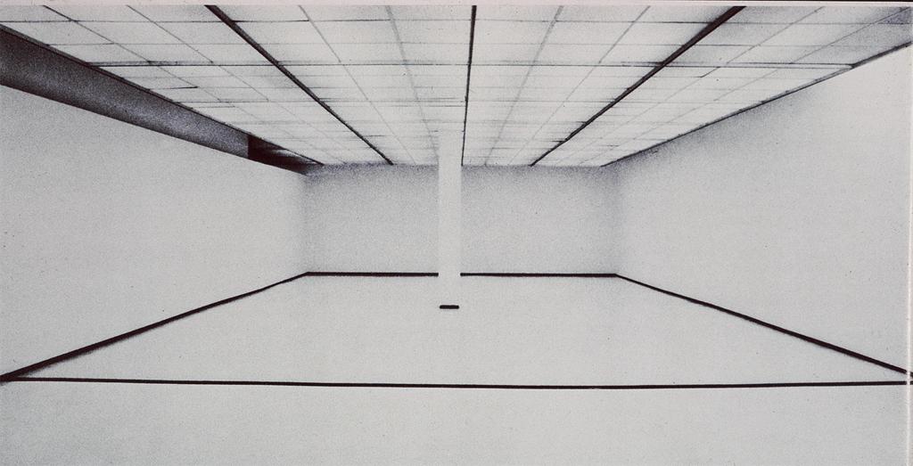
PART II Robert Irwin on "Scrim Veil-Black Rectangle-Natural Light (1977)" recently at the Whitney

Further reading:

Roberta Smith on Turrell "New Light Fixture for Famous Rotunda"  and Irwin "Ineffable Emptiness: From Dawn to Dusk"

Gabrielle Selz "Considering Perception: Robert Irwin and James Turrell": a look at their shared history.

Lee Rosenbaum: "Turrell's Skyspace Obscures the Sky"

Blake Gopnik: "Has the Sage Turrell Sold Out?"

March 12, 2012
Sometimes I think it’s my job to be the contrarian, although that hardly applies where Gerhard Richter is concerned. His work and philosophy have long inspired me, so it was a special pleasure to see Corinna Belz’s film, “Gerhard Richter Painting,” which confirmed everything I always wanted to believe about the artist. Belz has great understanding, both visual and intellectual, and strikes just the right note, which films about art hardly ever do. I won’t say more, because I’m most likely reviewing the film elsewhere, except to urge you to see it (even twice, as I did) at Film Forum, where it opens on Wednesday and runs through the 27th.


Also I learned, from watching Richter doing interviews in the film, how to answer impossible questions.  Which of his painting styles does he prefer? “It varies,” he says. What is his response to fame? “It varies.”  So helpful! Now when people ask me how much time I spend in the country or the city, I can say, “It varies.” Which do I enjoy most, painting or writing? “It varies.”


So now for the curmudgeon part—are you sitting down? Prepared for a terrible shock?  Okay, here goes…I am not a fan of Cindy Sherman. This is almost as huge as admitting I liked some of Damien Hirst’s spots, but I have always thought of Sherman’s work not as feminist, but anti-female, even mocking—clichés of women as established by the male world. Unlike the women I care about, her permutations are not warm, nurturing, sympathetic, or even sexual.  Would you choose any of them to be your best friend? I didn’t think so.


I may also be prejudiced because I remember how, just before Sherman made her film stills in the seventies, Eleanor Antin was transforming herself in photographs in ways that were more haunting, funny, varied and complex—as well as more human. Where Antin was clearly on a quest for self-knowledge, Sherman’s portraits come off as unflattering commentary on the aspirations and ways of life of others--especially in this series, which still strikes me as ageist, sexist, and just plain mean. (I’m plagiarizing myself here, as I wrote about this in an earlier post.)

Eleanor Antin, The King, 1972 (image from the Web)

Eleanor Antin, The Angel of Mercy (Florence Nightingale), Myself-1854, 1977 (Image from the Web)

And on, curmudgeonly, to Doug Wheeler’s sleeper show of the year, which had people braving the winter chill, lining up around the block to be admitted into the David Zwirner gallery, five at a time.  Before going further, I want to make it clear that I found the piece admirable, and waited to write about it because I didn’t want to interfere with anyone’s experience of it. If there’s a single form of art that has engaged me to the point of indefatigable research, it's this, “light and space” as it is called, the art of atmospheric environment, as exemplified by the work of Robert Irwin, Olafur Eliasson, James Turrell—as well as Fred Sandback, whose work, though not directly involved with light, engages the viewer in similar ways.


One of the things that impressed me most about Olafur’s famous weather project at the Tate Modern, is how he gave thought to every aspect of the experience, from the pre-publicity and catalogue (neither of which contained images or descriptions of the work, to the length of its run (when asked by the museum to keep it up longer, he refused).  Through my study of his work I took on this hyper-criticality, which has contributed to my campaign against artist’s statements and museum wall text, as they often to serve to direct and limit how work is experienced. So, for instance, while I admire Turrell, I began to see his requirement that viewers remove their shoes and put on Tyvek booties before entering certain installations, as a not only part of the experience, but an unpleasant one—even a form of subjugation on the artist’s part, as they make you look stupid.


I also dislike having to circumvent black curtains or don headphones.


So for me, the Doug Wheeler experience began with Ken Johnson’s rave review in the Times, after which everyone was talking about it, then the happily chatty and anticipatory cue along West 19thStreet, which began forming at least a half hour before the gallery opened. Once being allowed to enter the building, five at a time (throughout we were attended by a bevy of friendly, courteous gallery assistants, each more beautiful than the next), we were ushered into a room to wait our turn, sitting on wooden folding chairs (or in my case, a scarily wobbly shared bench next to the wall) arranged in a square so that we faced each other, as in Quaker meeting.


From there, again five at a time, we were invited leave our bags in a pile, take off our shoes and put on white booties similar to Turrell’s, which folded around our ankles like oversize institutional house slippers.


But then there was the space Wheeler created. With no evidence of floor, ceiling, or walls, it was like being suspended in air. When we went in, the slowly changing light was white. I tiptoed as far as I could go, stopping, as instructed, when the floor sloped up, and stood immersed, as if by fog.


My friend, Roberto, remarked that it was like being in heaven.


Photo: David Zwirner Gallery

Heaven, yes, but with refugees from an insane asylum, as everyone was moving slowly and their booties caused them to shuffle. The effect of the lighting was so much like that of seamless photography background paper that everyone looked like part of a fashion shoot, and thus highlighted became inadvertent performers.


Roberto and I became fascinated with a young woman in our midst who was shuffling about in a particularly distracted way. Everything about her was slack—her mouth hung slightly open, rumpled clothing fell loosely over her heavy frame, and her hair looked as if she just gotten out of bed—in marked contrast to the art students she came with and the fashionable gallerinas. Roberto dubbed her Sloppy Girl. “Meds,” he whispered to me. Who was she? What was she doing there? Was she going to be okay?


Ultimately Sloppy Girl is what we remember and still talk about—not, perhaps what the artist intended.


(Also note that the people in the publicity shot above, courtesy of the gallery, are NOT wearing booties.)
August 5, 2009

The rain has given us a break for the past two days—was threatened for today, but hasn’t happened so far—and now we have mosquitoes the size of helicopters. Last night in the garden, taking out the pea vines and replacing them with zucchini plants, an entire fleet landed on my ear. Even though I’ve sprayed it with so much Benadryl the afflicted organ is now stuck to my head, the urge to scratch it takes up nearly all my attention. With what little brain space I have left over, I will attempt to write a little about L.A., where the sun was out all the time and there were NO MOSQUITOES.


I said I didn’t want to go see art (“I’m here to see you”) but son Matt insisted and anyone who knows Matt knows that when he insists, it’s futile to protest. Besides he was right, as he usually is.


Our first stop was
Oh, and the chilled soup I got at the museum cafe in the courtyard. You can try this at home: beet puree mixed with watermelon juice and a touch of finely chopped mint. Perfect!

February 6, 2009
Christmas lights, Great Barrington, MA, December 2008

"What the cynics fail to understand, is that the ground has shifted beneath them."--President Obama's inaugural address.

I started writing this a month ago, but was so bored I didn't finish, because it's just too boring to write about being bored. But truly, since returning from Berlin in November, I've not been able to get interested in art, which is a problem considering that it's not only my field, but too late in life to take up another profession--such as plumbing or neurobiology, or become a concert pianist after all. However either out of habit or false hope, I've continued to trudge around to museums and galleries looking for inspiration, not just to write about, but for my studio practice, which is in need of a reboot.

What first set me on the road to ennui was Eleanor Antin, The King, 1972 (image from the Web)

Eleanor Antin, The Angel of Mercy (Florence Nightingale), Myself-1854, 1977 (Image from the Web)

After that it was the Institute of Contemporary Art (ICA) in Boston, a museum I want desperately to like, whose new building (and admission fee—$12 per person plus $11 or more for parking) sets off all kinds of expectations that, so far, have not been met by what’s inside. This time the main show was Tara Donovan, who makes installations with mass-produced disposable objects, such as plastic cups and toothpicks. I can see how the idea might be interesting (“Ooh, Honey, did you realize this is made of plastic straws?”) to someone who hasn’t taught a gazillion graduate students. In my experience, at least one third of the graduate population has latched onto similar ideas as a way of getting out of actually making something without having to spend much money or travel farther than the nearest convenience store (I wish I had a dollar for every piece of art I’ve seen made of black plastic garbage bags). Then there’s the text that suggests that because Donovan has figured out a way to make a cube out of metal sewing pins, she’s part of a lineage that includes Donald Judd—with whom she has about as much in common as Santa Claus.

Which brings me to one of my favorite subjects: wall text (some of my readers may already be aware of my promise to abolish it, along with artist statements, when I’m king). I’m clueless as to why such a small museum would give over any space to a permanent collection, but if they do, they’d better make sure it stands up to multiple viewings. This one threatens to become a Saatchi-esque time capsule, with texts that read like exercises one might be required to write in curator school. This, for instance, next to a painting that appears equally academically-driven:

Untitled continues Lucy McKenzie's exploration of latent meanings in design styles, expanding a detail from an advertising image she found on a condom vending machine of two robots amorously engaged. The scene is rendered in a Mondrian-esque style using geometric blocks and is rendered in faux marble to make the "ugly" scene appear more elegant. The work also includes two figures in shadow, as if in conversation while looking at the painting.

And back in New York, at the New Museum, while Elizabeth Peyton's paintings were charming, did they justify this curator's paean?

Where her earliest portraits can be compared to those of Dutch masters or Spanish painters in their quietude and focus on the aspect of a single subject in the center of the picture plane, beginning in the 2000s, Peyton's maturity as a painter is expressed in the increasing complexity of her compositions. In the history of portraiture, these later works can be more closely compared to figure compositions by Henri Matisse or Eduard Vuillard, both of whom integrated their human subjects with their static ones in dense surfaces of pattern and brilliant color.

But what finished me off was the Marlene Dumas painting exhibition at MoMA (through February 16th). As Peter Schjeldahl wrote in The New Yorker:

She has been favored by a fashion for sensationalized moral seriousness which explains the recent prestige of Francis Bacon and Lucian Freud and of younger masters of sardonic melancholy, including Luc Tuymans of Antwerp, and Neo Rauch of Leipzig. Is this taste a self-flagellating compunction of the spendthrift rich? Surely no one would paint pictures as aggressively uningratiating as those of Dumas unless she meant them.
Well, I don't care whether she means it or not, the "artist's intention" holds little interest for me, only the result--which here, despite Schjeldahl's rhapsody over Dumas's brushwork, is heavy-handed and depressing. I’m not opposed to so-called “serious” subject matter, but a little nuance would be nice. Interestingly, in that same New Yorker, David Denby reviews the film “Revolutionary Road,” and while finding it “honorably and brutally unnerving,” suggests that it “may suffer…from the illusion that pain and art are the same thing.” He could have been writing about Dumas.
After that I was sure I never wanted to see any more art ever again.
Later I began to think that my reaction had to do with the sense that the art I was seeing was looking old, because--in case you haven’t noticed--we’re in the midst of a great cultural shift. And unlike generations in the past who experienced the massive change that came with the invention of the printing press or the rise of the Industrial Revolution, we know it, can feel and see it. It’s fast, so fast that when I was working with the art director on TIME’s Person of the Year, he noted that if we had commissioned a portrait of Obama in October, it wouldn’t be the one we’d want to run in December. And the Tom Friedman piece of December 23rd that I wanted to link to when I started writing this, Time to Re-Boot America now feels as if it was penned a year ago rather than just a month or so.
It’s a time of purging, of getting rid of what doesn’t work and replacing it with…well we don’t know. But it’s inevitable that art will change with it, old systems will be replaced with new ones, and that which doesn’t deliver, will fail.
And while I don't have a crystal ball, I'll make some predictions just because this is my blog and I can. I believe that in the future (which, the way things are going, could be next week) we’re going to be less fascinated with human dysfunction (a la Dumas and Sherman) and seek more art that inspires us, has substance, puts us in awe of human capability. I hope that we’ll also figure out another way of experiencing art that doesn’t involve rectangular rooms, white walls, and track lighting. I want art to engage and involve, be more than this static thing that we look at while standing on our feet (although I dislike so-called “interactive art" even more), but has to do with its context and, like music, is woven into the fabric of our lives. I believe the era of the individual genius is waning, and instead collaborative ventures (between individuals as well as disciplines) will come to the forefront. That means chucking the our current system of teaching visual art, which has hardly changed for centuries (okay, so we teach “media arts” now, it’s still a separate department) and move toward one that’s integrated with science, mathematics, agriculture, history, and technology, as well as the other arts.
I also believe people will always be fascinated with painting.
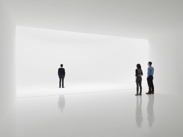
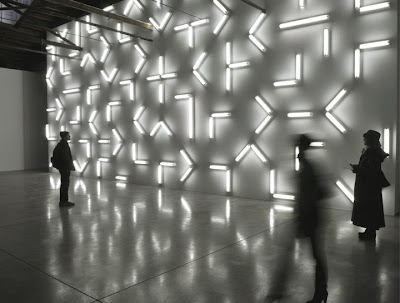
With these thoughts in mind, I went to Chelsea yet again, and this time saw two exhibitions that looked not only far from tired, but fresh and new. The irony is that one was done by an 80-year-old, Robert Irwin, and the other by Fred Sandback who, were he still alive, would be in his mid-sixties. Both installations are serene, sure, engaging and beautiful. Oh, did I mention beauty? Well I believe in beauty, and think it’s a human need, as important as fresh air and water. It's definitely due for a comeback.
Installation view of Robert Irwin's Red Drawing White Drawing Black Painting, on view at PaceWildenstein, 545 West 22nd Street, NYC through February 28, 2009. Photo by G.R. Christmas/Courtesy Pace Wildenstein, New York.


Installation view, Fred Sandback at David Zwirner, January-February 14, 2009. Photograph by Cathy Carver, Courtesy Zwirner & Worth.

These images , however, hardly convey the experience of being there, which is why Irwin, in the early days, refused to have his work photographed.
And Shepard Fairey is, for sure, of his/our time. Creator of the now iconic image of Obama that became so important to the campaign—as symbolic of our decade as Robert Indiana's Love was to the 60’s—the attention given him now is well-deserved. I knew about Fairey’s work through my son, Matt, and last year suggested to TIME that they commission him to do a portrait of the 2007 Person of the Year, Vladimir Putin, which ran on the inside of the magazine:

Vladimir Putin by Shepard Fairey for TIME, 2007

This year TIME invited Fairey to do another image of Obama (see video) for the cover, and it's every bit as strong as the first--and updated, more "now" than last year's poster. What I especially like about Fairey’s new fame--in this time of fallout from extreme greed--is that it stems from an image he gave away (which is why I think the current copyright flap won't hold water--as a picture-researcher friend, put it: "Since the poster/image took on a life of it's own, was 'used' by so many people without even Fairey's permission... how could one begin to determine a use fee?").

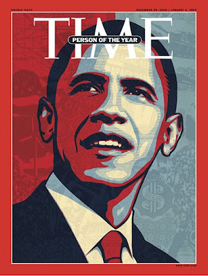
Barack Obama by Shepard Fairey for TIME, 2008

And now the ICA in Boston (so critized above) is on its way to redeeming itself in my eyes by being smart enough to mount the first museum survey of Fairey's work, which opens tomorrow and runs through August 16th.
December 1, 2008
Born to Run? Little Ones Get Test for Sports Gene on the front page of yesterday’s Times is an article about how Atlas Sports Genetics, in Boulder, CO “is playing into the obsessions of parents by offering a $149 test that aims to predict a child’s natural athletic strengths…The test’s goal is to determine whether a person would be best at speed and power sports like sprinting or football, or endurance sports like distance running, or a combination of the two.” One mother said, “I think it would relieve a lot of parental frustration.”

In our rush to control our children’s experience, we forget that people sometimes learn most from attempting to do those things for which they’re not naturally gifted.

As a child, my most obvious talents were musical, and although I studied classical piano for 20 years, I turned out to be an artist—no doubt because, not in spite of, of the challenges art continues to present.

I don’t practice yoga because I’m naturally flexible, but because I’m not.

In Lawrence Wechsler’s biography of Robert Irwin, Seeing is Forgetting the Name of the Thing One Sees, Irwin says:

In my years…as a teacher, I’ve seen it over and over again. It’s the kids with the greatest facility who can run up against the biggest problems. You are the best in your class without even trying, which is the best way to learn nothing…The not-so-facile kid just plugs along, every step is a working step, and he comes to the twentieth step and it’s just another step. But facility is a funny thing—it takes you way up, you soar, and you look like you’re really doing something—but at a certain point you go as far as you can with facility, and then you hit the big questions. And for you, who’ve never been pressed, that can present a huge roadblock. I’ve seen a lot of kids get waylaid at this point…

I’m convinced children are best served when the quality of their effort is applauded, rather than their success. ("The process is the reality," as Samuel Johnson said.) And because there’s a Times article to back up every opinion, here’s Praise Children for Effort, Not Intelligence, Study Says, from 1998.


June 25, 2008
James Turrell's Roden Crater

Thanks to “Pretty Lady,” “Spatula,” and CAP for comments on my last Whitney post that are worthy of being posts in themselves. While, CAP, I was perhaps too casual in saying “anything can be art,” I actually do believe that, at this point in time, anything someone makes or designates can be (note I said can be, not should be) considered art, and that recognizing this was a necessary step to get us away from the painting-on-a-wall, sculpture-on-a-pedestal mindset that pervaded the first half of the 20th century. I do not agree with “Spatula” that “we have gone too far in deconstruction” since I’m one who delights in art that uses an economy of means (Irwin, Turrell, Eliasson, and a moment of silence in a Sigur Ros concert) to achieve great ends.

However along with deconstruction, we lost our ability to discern. We went rollicking off in the other direction, making deconstruction an excuse for sloppy thinking, sloppy execution, sloppy everything. And I lay much of the blame for this on the proliferation of art schools who profit by making everybody think art is easier than it is, who in order to exist, need the majority of students to come away with a positive experience. I remember a final graduate crit at SVA, when I said to a student about her sculpture, “There’s a lifetime of work to be mined from this”—thinking that I was giving her my highest praise—and she burst into tears because to her mind, she was finished. This was it. What, she’d have to do more?

However I believe the resounding failure of the Whitney Biennial marks the beginning of the end of a too-long era. It goes along with the political scene. We want substance. As with the Iraq war, SUVs, and Froot Loops, we’re not inclined to think something is good for us just because the powers that be say it’s so. I’m encouraged by the fact that I’ve seen more good art in the past six months than in the last ten years put together—and that we’re having these conversations. Before when I saw stuff like Fritz Haeg's Animal Estates or the Whitney’s publicity I thought that I was the only one who thought it was ridiculous. It’s a relief to learn that I’m not alone.

Pages