Tate Modern
Art Vent Letting the Fresh Air In
August 26, 2013
Every hue throughout your work is altered by every touch you add in other places.
—John Ruskin
The work promotes a state of contemplation in a communal viewing space, rekindling the museum’s founding identity as a “temple of spirit”—Guggenheim Museum press release for James Turrell’s Aten Reign, on view through September 25, 2013.
For the past several weeks I’ve been trying to make sense of my profound underwhelm with James Turrell’s otherwise much-touted light extravaganza at the Guggenheim. I love the Guggenheim; the architecture makes any reason to go there a special event, and now one of my most-admired artists has filled the atrium with a giant hollow cone of light and color which, ovoid and tiered like a wedding cake, floats over a seating area like a flying saucer. Gently diffused by the cone’s scrim-like fabric, LED lights gradually shift from one gradated color to another, while muted natural light filters in through the skylight. What’s not to like?
It should be right up my alley. Turrell’s permanent installation at MoMA/PS1, Meeting (1986) is at the top of my ten best list. In addition, I’ve spent a good part of my professional life writing about Robert Irwinand Olafur Eliasson, who work with perception and light in similar ways. I also have a special affinity with Turrell because I, too, come from Quaker stock and have been a practicing Quaker. Meditation and contemplation are important parts of my life.
However, seated in the atrium at the press preview, instead of going into rapture, I began thinking about Eliasson’s circular 360°Room(s) for all Colors of similarly changing hues. There visitors are highlighted participants, lit like fashion models against a seamless background, where here they appeared to have little relationship with the piece that hovered above them. I also thought about how, in those Eliasson pieces, you can walk right up to the “wall,” which seems to have no substance but that of color, and practically put your nose in it—while the entire experience Turrell has created at the Guggenheim is “up there.” Not significantly related to the scale of my body, it felt separate from me, which meant I didn’t have the desired heightened awareness of my place in it—I was not, to employ the overused phrase, “seeing myself seeing”—any more than I would at a fireworks display. In every work of art the “here” and “there” are important aspects; to be fully satisfying, I want even a painting to tell me something up close as well as from a distance. In an installation, it’s even more important, because if my situation as a visitor isn’t fully developed, I don’t feel a connection with whatever else is going on.

Olafur Eliasson. 360° room for all colours. 2002. Stainless steel, projection foil, fluorescent lights, wood, and control unit, 126 x 321 x 321" (320 x 815.3 x 815.3 cm). Private collection. Installation view at Musée d'Art moderne de la Ville de Paris. Courtesy Tanya Bonakdar Gallery, New York. © 2008 Olafur Eliasson
The most important aspect, however, of “seeing ourselves seeing” is that our perception is challenged to the point that we no longer trust our normal visual clues. This produces a particular state of self-consciousness that merges with the work—and at this, Turrell has been a master. In his Skyscapes, like the one at PS1, the sky becomes a “thing” you feel you could almost touch, with the result that you find yourself simultaneously questioning it and yourself. And looking at one of his early, simple corner light projections, your brain processes it as a cube with actual mass, even though you know it isn’t. Nothing like that happens at the Guggenheim; while it’s beautiful, even stunning, there’s no mystery. What you see is what you get—an indication that the line between art and lighting design (which has become extremely sophisticated through the influence of artists) is now very, very thin.

James Turrell, Meeting(1986) MoMA/PS1. Photo: Carol Diehl, 2011
“He’s an orchestrator of experience,” Chuck Close has said of Turrell—but what makes up that experience? Where does it start and stop? Does it begin when you hear about it from a friend, or read a review? Those are things the artist can’t control, but he can influence what happens from the minute you walk through the door.
And what’s that like? My friend, David, a hospital administrator who made the mistake of visiting the Guggenheim with his out-of-town family on a weekend, described it as…“Horrible. Like Disneyland. There were 4-5 lines squeezed into the walled-off lobby, and you’re trying to get in line and bumping into everyone…and once you get your ticket and come into the atrium you’re trying to look up but can’t because there are so many people. It was pretty, but hardly transcendent. The architecture was all covered up and you could have been anywhere. And then, still bumping into people, you walked up the walled-off ramp, which felt like a missed [artistic] opportunity, to stand in more lines. Not that we were looking to be entertained, but we were looking for $20 worth of something.”
Another friend said the guards were ordering people around, telling them to get off the floor if they tried to lay on it….”It’s not their fault,” he said, “They were only doing their job, but it could have been managed better.”
So how much of that has to do with Turrell? I think it all does.
Much to the annoyance of painting students when I refuse to overlook a warped stretcher (the perpetual question being, “Is this intentional?”), I have always contended that everything that falls into my experience is part of the piece—a view that has fueled my no-doubt tedious bloggy diatribes against artists’ statements, wall text, audio tours, black-out curtains, headphones, etc.
I was irritated when, a few years ago, I found that entrance to a Turrell installation, required shedding my shoes and donning floppy Tyvek protective booties. While surely an over-reaction on the part of one who’s invested too much in her fashion statement, I interpreted this as a power play on the part of the artist (“Really? Part of your piece is to make me look ridiculous?”).
So yes, in my book, the queues, crowd control, and the need for crowd control are all part of it. This is, after all, the same museum that, in 2010, featured relational aesthetics guru, Tino Seghal, whose piece involved engaging visitors in conversation. After that and many similar, such as Martha Rosler’s garage sale and Marina Abramović’s The Artist is Present, both recently at MoMA, it would be arbitrary to insist that personal interactions are significant in one circumstance, but not in another.
Eliasson (who was largely inspired by Robert Irwin, also my biggest influence, and now both have shaped my thinking) was aware of this responsibility on the part of the artist back in 2003, when he configured his monumental weather project at the Tate Modern. Approaching the institution as a whole, part of his preparation involved talking to members of each of the museum’s departments to discuss how their roles would impact his project.

Olafur Eliasson, weather project (2003), Tate Modern
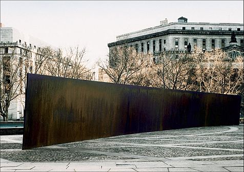
Eliasson also configured something that could handle the crowds it brought—which raises a related question: what is the artist’s accountability to the social situation his work is creating and/or occupying? For defenders of Richard Serra’s threatening Tilted Arc, which after much controversy, was ultimately removed from a busy office plaza, the answer was “None.” But much has gone on since 1989, with artists now more aware of, and willing to embrace, the public nature of their work. If relational aesthetics has had a positive impact, it has been to highlight the artist’s role in configuring the entire art experience.
All of this casts doubt on the decision to turn Frank Lloyd Wright’s soaring masterpiece into a confined area that requires limited entrance—and attempt to create a relatively intimate space in a public institution whose most basic function is to accommodate large numbers of people. Another power play perhaps?
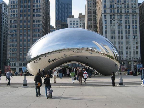
I like to think of “generosity” in terms of public sculpture/installation, as a measure of the number of ways a work may fulfill the artist’s intention to successfully affect his audience. For example, few works are more “generous” than Anish Kapoor’s Cloud Gate in Chicago’s Millennium Park. Installed in 2006 and nicknamed “The Bean” for its shape, this giant organic structure of highly polished stainless steel is engaging day and night, from afar, up close, and even underneath, involves light, reflection, and movement, and is as affective in the presence of crowds as it would be in solitude.
Anish Kapoor, Cloud Gate (2003-6), video: Carol Diehl (2012).
This is not to say that art has to be popular or even pleasing, but that it fulfills its purpose on every level. Therefore, if the intention of a piece was about the frustration of not being able to see it, say, then the question of its success would be, was everyone sufficiently frustrated?
Frustration and contemplation, however, do not go together.
Frustration and contemplation, however, do not go together.
Meanwhile, the frustration at the Guggenheim continues even after one leaves the atrium and attempts to see Turrell’s earlier works by joining the crowds to ascend the museum’s curving ramps, now claustrophobic tunnels with “walls” of opaque white fabric that block any view of the atrium. As students know, one of the first questions one asks when evaluating any sculpture is, does it perform equally well from all sides, or does it have a “dead zone?” This is something sculptors like Mark de Suvero and Richard Serra have obviously given a lot of thought to—as did the ancient Greeks. And especially now that sculpture engages the scale and dynamics of architecture, just as with personal interactions, it seems arbitrary to insist that we shouldn’t take the outside of Turrell’s cone into consideration as an integral part of the piece—it was, as my friend, David, put it, a “missed opportunity.”


Photo by 

Jenny Holzer,

ROBERT IRWIN: SCRIM VEIL—BLACK RECTANGLE—NATURAL LIGHT, WHITNEY MUSEUM OF AMERICAN ART, NEW YORK (1977)
JUNE 27–SEPT 1, 2013 Photo: Carol Diehl 2013PART II Robert Irwin on "Scrim Veil-Black Rectangle-Natural Light (1977)" recently at the Whitney
Further reading:
Roberta Smith on Turrell "New Light Fixture for Famous Rotunda" and Irwin "Ineffable Emptiness: From Dawn to Dusk"
Gabrielle Selz "Considering Perception: Robert Irwin and James Turrell": a look at their shared history.
Lee Rosenbaum: "Turrell's Skyspace Obscures the Sky"
Blake Gopnik: "Has the Sage Turrell Sold Out?"
Comments (5)
July 18, 2012
After ranting about the Art Institute of Chicago’s restaurant choices: the reservations-only, pretentiously-named Terzo Piano, which provides “signature cuisine” for the 1%, or the downstairs Museum Café, with pizza, burgers, and plastic dinnerware for the rest of us plebes, I was pleased to read this quote, in The New Yorker’s recent profileof Tate Modern director Nick Serota: “We did a survey of about forty artists before we began….We thought that if we could make spaces in which artists liked to show their work, then the public would also respond to them—we wanted spaces that the public would feel comfortable in. For example, it was a very deliberate decision to make this [the café] a good restaurant, but not a high-end one.”
Meanwhile all of the artist members—John Baldessari, Catherine Opie, Barbara Kruger, and Ed Ruscha—of the board of directors at L.A.’s MOCA have quit.
“To live with my conscience, I just had to do it." Baldessari said in an interview Thursday after emailing his decision to MOCA. He said his reasons include the recent ouster of respected chief curator Paul Schimmel and news this week that the pop-cultural slant the museum has taken under director Jeffrey Deitch will continue with an exhibition on discomusic's influence on art and culture.
“When I heard about that disco show I had to read it twice. At first I thought 'this is a joke' but I realized, no, this is serious. That just reaffirmed my decision.
“That disco show” refers to an upcoming exhibition—no date yet set—that will examine the supposed cultural impact of discomusic on art, fashion and music. It will be co-curated (who is the other curator? Deitch?) by James Murphy of the band, LCD Soundsystem, which broke up last year at the peak of its massive success because, Murphy said, "It was living a life that nobody would live forever."
Although I’ve been a huge LCD Soundsystem fan and will probably regret for the rest of my life not having seen them live, I want to point out that James Murphy was in grammar school during the disco era while, to borrow a phrase from one of LCD’s best songs, I was there.
I was there and disco was not anything artists were interested in. In fact, it was a pejorative word. Disco was AM radio, the boroughs, and secretaries on their nights off, when we were into punk, New Wave, ska, and funk. Studio 54, Warhol and Bianca, was stuff we read about in the Post gossip columns, and besides, Warhol was old by then, in his middle 40s, a veritable éminence grise—while we had CBGB, Danceteria, Area (where the theme changed every month), the Pyramid, 8BC and, in its marvelous decrepitude, the World. No one had any desire to go above 14th Street or wear a polyester suit. My record collection didn’t include Donna Summer, Barry White, the Bee Gees or the Jacksons but James Brown, George Clinton, Parliament-Funkadelic, Blondie, the Velvet Underground, the English Beat, the Sex Pistols, the Clash, and the Dead Kennedys. I loved “Saturday Night Fever” but it didn’t have anything to do with me. I put on the Talking Heads’ “Psycho Killer” to get myself up and out the door to work.
It was also a time when artists and writers called the shots in the art world—not businessmen.
My concern about the disco show isn’t the pop culture aspect, but that it could end up being a simplification rather than a clarification of history, a glamorized, homogenized, Mad Men-esque perspective of a complex time. We have only Deitch’s track record so far to go on: by all accounts his 2011 “Art in the Streets” was the show of the year (that I didn’t see it is another big regret, as Street Art is a major interest of mine), while his current James Dean exhibition, curated by James Franco, as well as his first venture, photographs by Dennis Hopper, seem to have been critical flops. And the now infamous Marina Abramovic performance/dinner, was simply appalling.
A bigger issue, however, is the way the firing (framed as a “resignation”) of Paul Schimmel was handled—by the head of the board of directors, yet—and that it may signal the complete takeover of museums, like everything else, by self-interested moneymen (be sure to read more here). It also seems as if the artist members of the board were left in the dark, which alone would be reason to quit.
Of course if the director curates, the museum doesn’t have to pay a curator—which is a good thing, because Deitch and Broad will have a hard time finding a decent curator who will work for them after this.
At the same time, it’s important to be open to change, and who knows? Maybe the disco show will be great.
It makes me think of other famous art world walkouts like (I wasn’t there) when Sidney Janis introduced Pop Art with his international “New Realists” exhibition (among the 54 artists shown: Roy Lichtenstein, Andy Warhol, Claes Oldenburg, James Rosenquist, George Segal, Richard Lindner, Wayne Thiebaud, Jim Dine, Robert Indiana, Tom Wesselmann, George Segal, Yves Klein, Arman, and Christo) prompting a dramatic exodus from the gallery by AbExer’s Mark Rothko, Adolph Gottlieb, Philip Guston and Robert Motherwell (only de Kooning stayed on).
And when I came from Chicago to work at Artforum in 1976, smoke was still hovering from the Lynda Benglis scandal, over an ad for which she posed nude with a gold-plated dildo, an event that caused Contributing Editors Rosalind Krauss and Annette Michelson to quit and three others, Lawrence Alloway, Max Kozloff, Joseph Masheck, to write a letter to the editor, then John Coplans, protesting this “object of extreme vulgarity”—which just looks funny now.
I refuse to make predictions. Back in the day, an acquaintance from Australia told me about a band called the Bee Gees, who were “really great” and I said, “With a stupid name like that, they won’t get anywhere.”
Update 7/22/12: Another POV here. 7/23/12 Roberta Smith on the debacle here. Even more here. This is almost as good as Downton Abbey. And now Rob Storr weighs in.
Update 7/22/12: Another POV here. 7/23/12 Roberta Smith on the debacle here. Even more here. This is almost as good as Downton Abbey. And now Rob Storr weighs in.
June 22, 2012
I’ve been back from Europe just over a week, but life’s intervening challenges have made it seem like three. Or maybe I was never there. Perhaps I just dreamed it. Regardless, I will share my hazy memories.
Ranting, as I have recently about museum buildings that are more about architectural hubris than art, it was a pleasure to revisit the Beaubourg for the Richter retrospective and see his work installed in an airy, non-linear context that included natural light and breathtaking views of Paris. See? It can be done. Ironically, one of the architects for the museum, which was built in 1977, was Renzo Piano, who's also responsible for the new, architect-centric Modern Wing at the Art Institute of Chicago. But at least, earlier in his career, Piano proved that artwork and architectural statement can happily coexist.
Gerhard Richter at the Centre Pompidou
The ecstatic ride from Damien Hirst to cream tea.
September 6, 2010

Doris Salcedo, Shibboleth (2008), Tate Modern, London
Thanks for the thoughtful comments on the post below, and if you didn’t read them before, please do. They are all worth reprinting, but here are two snippets:
“beebe” said: The problem at this point is systemic. Having somewhat recently gone through an MFA program, the main focus was on the statement--talking about the work, weaving a skein of bullshit around the work. The language surrounding the work and your inevitable defense of the language (and, secondarily of course, the work) is more important than actively making better work.
From “CAP”: Even critics want to take their cue from the artist's best intentions, in advancing an interpretation or assessment. But this really reflects a lack of confidence in an historical framework and personal intuition. The critic turns to intention to skirt thornier issues of style and form….
Whenever I bring up artist’s statements, it seems to touch a nerve. And rarely, if ever, have I gotten a comment in their defense (such as “I love artist’s statements!” “Once I read one, I can't wait to read more!”) yet they persist—like the weather, everyone talks about them but no one actually does anything.
There are several issues at play here. “Thi Bui” who doesn’t like “self-absorbed or insincere statements either” asks, however, “why don't we care about where the work comes from, or what the artist is trying to do?”
We don’t care because it has nothing to do with the experience of the work. Like music, the beauty of visual art—emphasis on the word visual—is its ability to communicate through non-verbal means, and is therefore more about sensation than thought. The delight is in its mystery, which by its nature defies explanation. If we want to communicate messages, writing is a better vehicle.
Also, any statement that tells us what a work is about or what the artist intends, limits the interpretation—in effect it pre-digests the experience so that it's hard to see it through any other lens. My favorite example is Doris Salcedo’s (2008) installation,
the “crack” at the Tate Modern that I wrote about with relish in two blog posts. On its own, the piece was quite powerful; recalling fault lines or dry riverbeds, it threatened our sense of stability and security, brought to mind all manner of social and physical separations and divisions, the unknown beneath our feet, the feeling that nothing is permanent, nothing is forever, that there are forces bigger than ourselves….and I’m just getting started. But once you become aware that Salcedo sees her work as “addressing a long legacy of racism and colonialism that underlies the modern world…” the whole thing goes flat, suddenly no more than a grandiose illustration of a lofty and banal idea.
Artists work from instinct, and may not be aware of the various possibilities of experience and interpretation that the work makes available. Interpretation is the work of philosophers and critics, and as an artist I’ve learned more about what my work “means” by reading about it than I did through the thoroughly intuitive process of making it.
The problem is that curators and critics are also relying on biography, intention, and social content to interpret art and justify it. When I wrote my article about Anne Truitt for Art in America, I devoted a portion of the article and several blog posts (see label for Anne Truitt) to the way the curator insisted on interpreting Truitt’s work through biography in the most elementary way—while acknowledging that “Truitt herself was reticent to make fully explicit the connections she nevertheless acknowledged between her life and art.” I came to the conclusion that the curator, who was a graduate of a curatorial program, simply did not know any other way to assess art.
However there is another way: observation
—
the act of looking at and experiencing the work and, as CAP points out, having confidence in our personal intuition.
What’s there is there, right in front of you, and what’s not there is….not.

Photo: Carol Diehl (2008)
April 21, 2008
 Bruce Nauman, Double Poke in the Eye II, 1985, neon construction, Kemper Museum of Contemporary Art, Kansas City, Mo.
My post "Impenetrable prose from the Whitney Biennial" clearly hit a nerve, whizzing around the Net in the last couple of weeks before bouncing out into the print media, the subject of “Being at Ease With Difficulty” defended the academic tone by saying, “the blogger culture lends itself to an anti-intellectualism that has its way of raising its heads in a gang.”
The anti-intellectual label is easily hurled, as is the accusation that anyone who suggests that ideas might be rendered in a readable and understandable manner is somehow calling for a “dumbing down.”
So when Hrag Vartanian states, “If the ideas are complex it is because they often grapple with concepts that resist simplification,” I insist on distinguishing between "simplification" and "clarification." It is not necessary to simplify in order to clarify. Further, I'm suspicious of any idea that can’t be clarified.
Anyway, the issue at hand is not about difficult ideas being made simple, but simple ideas being made difficult.
What I’m calling for is not a “dumbing down” but a “smartening up.” I’m asking for readers of the fatuous phrases that litter artists’ statements, press releases, and museum text not to swallow them whole, but ask themselves: “What is this really saying?” “Does it make sense?” And more, “What does it have to do with the art at hand?”
In an email, Janice Gewirtz, a reader of the Wall Street Journal, thanks me for my criticism of what she coined the “Emperor’s New Biennial” and says, further, “These overblown installations say nothing cogent about the subjects they ostensibly tackle. Rather, they reference ‘pop culture,’ or ‘sexuality,’ or even the notorious ‘fluid communication structures’ (whatever that is) as buzzwords.”
Exactly. That's what I was referring to in my posts here and here about Doris Salcedo’s crack in the floor of London’s Tate Modern, which is billed as “addressing a long legacy of racism and colonialism that underlies the modern world.” Sometimes a crack is just a crack.
Idly Googling “artspeak” the other day (procrastination is a wonderful thing), I came across an essay by John Haber, written in 1997, where he nails the origin of this language:
…am I imagining it, or do they blend together—the gallery press release and a parody of management jargon?…. It may have its roots in academia, where scholars hope to share their hesitant insights with students and peers. It may look back to art journals, where critics fumble for words to describe works of art rich in emotions and ideas. However, that is not where artspeak begins, and complaints about it hide its origins all too well.
Worse comes to worse, academics will trip up on their own humanity. Worse comes to worse, they will stumble on insights as unfamiliar and unpronounceable as art itself. Artspeak really starts sometime later, when critical clichés pass through the gallery system and into the marketing departments of major museums, eager for a larger public and bigger institutional gifts.
Promoting art is business, big business, and money talks. I call its language martspeak.
So perhaps now that it’s been defined for us--the language of two industries, academia and the art market, who have joined together for their mutual economic benefit--when we see it, we'll more easily recognize martspeak for what it is.
Haber continues:
Words never contain a work of art. Words can, though, encourage its reconstruction. They can create small openings in the walls that already exist, so that others may begin to look—and to see….
Art asks one to enter into a broken conversation, a half-overheard dialog between the work and the world. Newcomers to art distrust that demand. Most, often, too they would never know how to begin. A critic’s job is to break the ice.”
Something that all of us who write about art—be it our own or that of others—would be wise to remember.
February 25, 2008

The installation at the Tate Modern (below), Doris Salcedo’s Shibboleth provides an excellent example of rhetoric standing in for, or justifying, the art. This is excerpted from the publicity material, which I suggest reading in toto just to get the full effect:
Salcedo is addressing a long legacy of racism and colonialism that underlies the modern world…” The history of racism,” Salcedo writes, “runs parallel to the history of modernity, and is its untold dark side”…. Our own time, Salcedo is keen to remind us, remains defined by the existence of a huge socially excluded underclass, in Western as well as post-colonial societies…”
Hullo, it’s a crack. A crack. A break in concrete. The artist’s intention does not change the experience, which happens to be one that leads to strange parental behavior. But if you insist on metaphor, it could represent any disparity—including the one between those who are willing to shell out $50 for a Duchamp T-shirt and those who aren’t.
February 23, 2008

The artist, Doris Salcedo, has titled it Shibboleth, but everyone in London just calls it "The Crack." Salcedo's long, fractured opening in the concrete floor of the vast Turbine Hall at the Tate Modern is the latest installation in the Unilever Series, and a non-event as far as this viewer is concerned, since it never gets wide enough to seem like any kind of real division or threat. Children like fitting themselves into it and waving for the camera, and when I was there parents were busy dipping babies into it, something my friend, Emily, pointed out they would never do if they came across a similar opening in a street or sidewalk. However the Duchamp, Man Ray, and Picabia show, installed in 13 rooms, was totally worth the visit. I liked the T-shirt, too, black with a white Duchamp spiral, but at £25, almost the equivalent of $50, I passed it over.