Robert Irwin
Art Vent Letting the Fresh Air In
November 27, 2007
 There are people in the world who spend much of their time conjuring up geometric forms no one has used before. One such person is my previously-mentioned friend, Einar Thorsteinn, whose configurations often appear in Olafur Eliasson’s work. Einar just sent me these photos (click to enlarge) of himself in Olafur’s studio, working with one of his latest, which has the working title of “MoMA Joint” because it’s intended for use in Olafur’s upcoming survey exhibition at the Museum of Modern Art. Einar suggests that the stackable form can have other, more practical applications, such as being cast in concrete for the walls of a house, where the openings could become windows.
 The level of rigor Einar contributes to Olafur's work was what I found lacking in the wire sculptures in Antony Gormley’s recent show at Sean Kelly (up through December 1st). I want to like Gormley’s work because I’ve never forgotten the first piece I saw of his in 1991--entitled Field, it consisted of 35,000 handmade clay figures assembled on the gallery floor, all of whom seemed to be beseeching me. With overtones of war and poverty—even though those issues weren’t addressed directly, or perhaps because they weren’t—it was quite moving.

However these current sculptures of Gormley's seem rather lackadaisical--as if they haven't made up their minds whether to be tight and geometric or loose and organic, but hover uncomfortably in-between--and his glassed-in room filled with steam needs some additonal aspect to make it more than....a glassed-in room filled with steam. It’s a lot of technology for not a lot of impact. When an artist puts that much effort and expense into building something, our expectations rise accordingly—whereas Robert Irwin gets a lot more mileage out of a mere piece of scrim.
Gormley: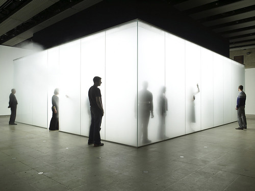
Irwin: 
Comments (0)
September 2, 2007

My review of Robert Irwin’s PaceWildenstein show is in the September issue of Art in America with a photo that will tell you very little about what it was like to experience that installation. Irwin used to refuse to have his work photographed, and with this piece especially, it’s easy to understand why. A photograph can only reproduce what’s concretely there, and what was so palpable about this piece was what was not concrete—the sense of energy that resonated in the space between the panels on the floor and ceiling. In a conversation with Irwin at the time I was writing the review he described his intuitive process: “You don’t plan it,” he said, “you court it.”


Robert Irwin
Who’s Afraid of Red, Yellow and Blue³
PaceWildenstein, 545 West 22nd Street, New York City
December 9, 2006 through January 27, 2007
Photo by: Genevieve Hanson / Courtesy PaceWildenstein, New York
June 21, 2007

I think a lot about art and its context, especially after the Serra show, where the surroundings were too severe, and then visiting Wave Hill, where it’s a challenge for art to compete with the gorgeousness of the place. Actually, the grounds are art and should be seen as such. The design is the concept of a singular man—Scott, who knows everything, told me—the recently retired Marco Polo Stufano. One wonderful thing is the unexpected juxtaposition of vegetables—fabulous heads of shiny purple lettuce, corn even—with more traditional ornamental plants. However there are certainly artists who would be up to it, either by contrast or by fitting in, who could make even more of that site, or the rooms of those elegant buildings--Robert Irwin being one of them, of course, and Spencer Finch if he were trying (while I love his Mass acheter viagra MoCA show, his offering at Wave Hill was lame at best; perhaps he thought no one would see it).
My first experience of the inspired confluence of art and architecture was in the early eighties at a Pop Art exhibition in Venice’s Palazzo Grassi, where a giant Warhol Mao, at least 20-feet-tall, was installed in an impossibly ornate room that I remember as being taller than it was wide and ringed with several stories of balconies. Ever since, my impatience with the white box has been growing. I think it's one of those art world assumptions—having to do with the notion that art is sacrosanct and should not be interfered with—that took hold and now, never questioned, is self-perpetuating. (Along with another of my bugaboos, the idea that items in a retrospective need necessarily be installed in chronological order.)
I know that, as an artist, I’m not supposed to like Frank Lloyd Wright’s Guggenheim, but I do, and not just because I welcome any opportunity to walk uphill. It always feels special to go there, an event, and more than any other museum, I have distinct memories of not only the works I’ve seen there, but where and how they were placed, how I felt coming upon them, and how they looked from a distance, across the atrium. What other museum offers you a view of something from eighty (I’m guessing here) feet away? In the Guggenheim you view works one at a time, whereas in the white box you must make choices about what to do with your attention, so whenever you’re looking at something you must always be conscious of what you’re not looking at as well.
Thus my irritation with the Serra installation at MoMA (the white box plus track lighting—ugh!) and don’t even get me started on the Brice Marden show. All right, get me started. I like Marden’s paintings. I’ve come upon a single Marden somewhere and been blown away, and I remember seeing a perfectly exquisite Marden show at the Serpentine Gallery in London. But I wouldn’t want to be Marden. To have to get up in the morning and face those canvases day after day? (As a rock musician friend said, after I played him Philip Glass, “It’s a dirty job, but somebody has to do it.”). And when you combine repetitive paintings with a repetitive installation you come up with something you want to walk through very fast. Curators who insist on mounting the works in chronological order (and I’m not saying it might not work in some cases—as Robert Irwin says, “Sometimes the best solution is the cannon on the green”) are making a statement that values development over aesthetic experience. In Marden's MoMA exhibition, I would have liked to see the ribbon paintings interspersed with the monochromatic panel paintings; this would have created a textured environment where each piece could be seen on its own merits, without the distraction of an almost identical one next to it. To find out about Marden's process of development, there could have been a handout and/or wall text at the end, illustrated with small reproductions, that listed the order in which they were created.
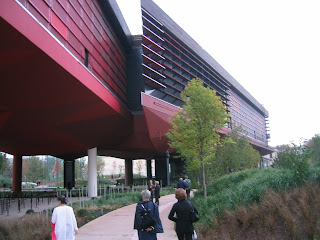
An example of a thoughtfully installed show that doesn’t lean heavily on chronology is the Louise Nevelson retrospective at the Jewish Museum (on view into September). And according to Art Daily, Michael Govan, formerly of the Dia Foundation and now the director at the Los Angeles County Museum, is intending to use artists—including James Turrell and Jorge Pardo—as designers. What if one artist were to design the exhibition space for another? How cool would that be? I’d let Robert Irwin design a space for my paintings! Rem Koolhaas designed an exhibition for Terry Winters in SoHo once upon a time, which could have been more successful (except I do remember it clearly, which is something), but given how fabulous his Student Center is at the Illinois Institute of Technology (below)—when you are in Chicago, don’t miss it!—if he volunteered I’d let him have a go as well.
My first experience of the inspired confluence of art and architecture was in the early eighties at a Pop Art exhibition in Venice’s Palazzo Grassi, where a giant Warhol Mao, at least 20-feet-tall, was installed in an impossibly ornate room that I remember as being taller than it was wide and ringed with several stories of balconies. Ever since, my impatience with the white box has been growing. I think it's one of those art world assumptions—having to do with the notion that art is sacrosanct and should not be interfered with—that took hold and now, never questioned, is self-perpetuating. (Along with another of my bugaboos, the idea that items in a retrospective need necessarily be installed in chronological order.)
I know that, as an artist, I’m not supposed to like Frank Lloyd Wright’s Guggenheim, but I do, and not just because I welcome any opportunity to walk uphill. It always feels special to go there, an event, and more than any other museum, I have distinct memories of not only the works I’ve seen there, but where and how they were placed, how I felt coming upon them, and how they looked from a distance, across the atrium. What other museum offers you a view of something from eighty (I’m guessing here) feet away? In the Guggenheim you view works one at a time, whereas in the white box you must make choices about what to do with your attention, so whenever you’re looking at something you must always be conscious of what you’re not looking at as well.
Thus my irritation with the Serra installation at MoMA (the white box plus track lighting—ugh!) and don’t even get me started on the Brice Marden show. All right, get me started. I like Marden’s paintings. I’ve come upon a single Marden somewhere and been blown away, and I remember seeing a perfectly exquisite Marden show at the Serpentine Gallery in London. But I wouldn’t want to be Marden. To have to get up in the morning and face those canvases day after day? (As a rock musician friend said, after I played him Philip Glass, “It’s a dirty job, but somebody has to do it.”). And when you combine repetitive paintings with a repetitive installation you come up with something you want to walk through very fast. Curators who insist on mounting the works in chronological order (and I’m not saying it might not work in some cases—as Robert Irwin says, “Sometimes the best solution is the cannon on the green”) are making a statement that values development over aesthetic experience. In Marden's MoMA exhibition, I would have liked to see the ribbon paintings interspersed with the monochromatic panel paintings; this would have created a textured environment where each piece could be seen on its own merits, without the distraction of an almost identical one next to it. To find out about Marden's process of development, there could have been a handout and/or wall text at the end, illustrated with small reproductions, that listed the order in which they were created.
An example of a thoughtfully installed show that doesn’t lean heavily on chronology is the Louise Nevelson retrospective at the Jewish Museum (on view into September). And according to Art Daily, Michael Govan, formerly of the Dia Foundation and now the director at the Los Angeles County Museum, is intending to use artists—including James Turrell and Jorge Pardo—as designers. What if one artist were to design the exhibition space for another? How cool would that be? I’d let Robert Irwin design a space for my paintings! Rem Koolhaas designed an exhibition for Terry Winters in SoHo once upon a time, which could have been more successful (except I do remember it clearly, which is something), but given how fabulous his Student Center is at the Illinois Institute of Technology (below)—when you are in Chicago, don’t miss it!—if he volunteered I’d let him have a go as well.
Other people thinking creatively out there include architect Jean Nouvel who, in his Paris Musee du Quai Branly for indigenous art, has completely rethought the museum experience. It’s a place where the architecture is very evident, but serves only make the art look better. When I was there in October they wouldn't allow photography inside, but to whet your interest here's an exterior view:
Not all artists want a pristine environment for their work. When I was talking about this with Judy Fox, she told me she fanaticizes about having her life-size sculpture of Snow White in her glass coffin being purchased by collectors who will use it as a coffee table “with the children’s book,” she says, “as the coffee table book on top.”
June 11, 2007
 Yesterday I went to Wave Hill in Riverdale in the Bronx for the opening of a group exhibition with a Thoreau theme that included my friend, Richard Torchia. I couldn’t believe I hadn't been aware of this spot so close to the city, with its soaring views of the Hudson and Palisades, where the buildings, grounds and gardens are so extraordinarily beautiful that—unless extremely carefully considered and well-placed—any attempts at artifying it come off as superfluous and jarring, like bad jewelry with an otherwise perfect outfit.
Richard's piece was deep in the woods, a simple structure the size and shape of Thoreau's cabin at Walden Pond. Inside the darkened room, on opposite walls where the two windows would have been, camera obscura lenses reflected the gently waving leafy branches outside. Watching it was mesmerizing—even more so, I was aware, than the actual scene outdoors. It reminded me of the time my sons were small and we went to a performance at the Goodman Theater in Chicago where they began fidget and we left early. Walking through the lobby, however, they became transfixed in front of a video monitor—a simultaneous broadcast of the play that had so bored them in the theater minutes before. At the time I chalked it up to the power of television but now—after recalling that, in general, TV was not a big attraction for them—I think the video may have focused the action so that they could get more of a handle on it. It made me think about art as a mediation of experience and how, by eliminating the distractions, it can often act as a felicitous narrowing--rather than a broadening--of vision, a chance to see the world through someone else’s eyes.
Then Richard took me on a circuitous route into the woods to show me this single stone embedded in the path, which he told me was left over from an installation by Robert Irwin:
